
Is It Good to Have a Handwriting?
It was kind of funny but also made me think when I showed the last post (Nota, A Didot Font for Vogue) to my partner, recently. Just for curiosity or to speak about “good ole times” a little I found her claiming out “Oh, I know this one!”. She didn’t, as I found this in my old archives and was sure to never have shown it to her. So, I corrected her politely just to be informed what she meant: “I clearly saw your handwriting. So I thought to have seen it before.” Well, should I be happy with an answer like that or shouldn’t I?
My German soul told me to be not, as this means to have created something like a repetition, something that never could have possibly reached its target: as for to create a unique solution to a given task. Which implicates somehow also to be free of personal shading, just like of everything else that could weaken its intent.
My Italian soul, though, shouted out: Yes, you did something really good! To explain that different concept I would have to go back to my beginnings as a graphic design freelancer in Milan and Rome1 in the late nineties and starting 2000. A period which I remember as kind of frustrating but also incredibly worth while (not to speak about a very happy personal life).
We formed a group of highly gifted designers (I am referring more to my Italian colleagues as I always felt almost kind of misplaced between those talents) each one with a kind of niche. We had imaginative illustrators, film producers and future orientated (* loving) graphic designers. As an organizing element someone a bit more of age with a widely spun net of personal contacts to publicity agencies, editors and so on. And he had a quite simple, but successful maxim:
“Go out and find your style as why should someone book you if he could book someone else instead?”
Unlike the somehow typical German concept to free yourself from personal points of view to be able to confront each single assignment in a different and most suitable way the Italians do the opposite. They are convinced that a personal point of view, “unique” is everything that counts and that it will somehow magically solve, if not all communication needs, at least the ones that you are perfectly suited for. Which, in the end, will make you recognizable as an unique “artist” and, most of all, make you work.
Well, I guess both of them are right in their way. What concerns me, I was struck by the results that my Italian colleagues produced: so unique, so creative, so fearless indeed! So I guess, I decided to opt for their way and to be not so concerned if someone might tell me “Yeah, we see that it was you!” but simply happy. I see it as a way to stay in someones mind, to be contacted in the future for that special handwriting you can give to a project. And I think this is besides all the technical issues more than valid for creating typefaces.
Something almost inexplicable which is probably a melting pot of all he used to watch in his career or he is generally influenced by as an artist.
Since, speaking of style, this does not exclusively refer to a certain taste or predilection in the choice of historical periods as role models for ones typefaces nor a design intention like aiming to be modern, futuristic, experimental or classic. It is reflected in the way a designer treats a curve, the solutions he prefers to execute form conjunctions or the way he interprets swellings and roundings. Something almost inexplicable which is probably a melting pot of all he used to watch in his career or he is more generally influenced by as an artist.
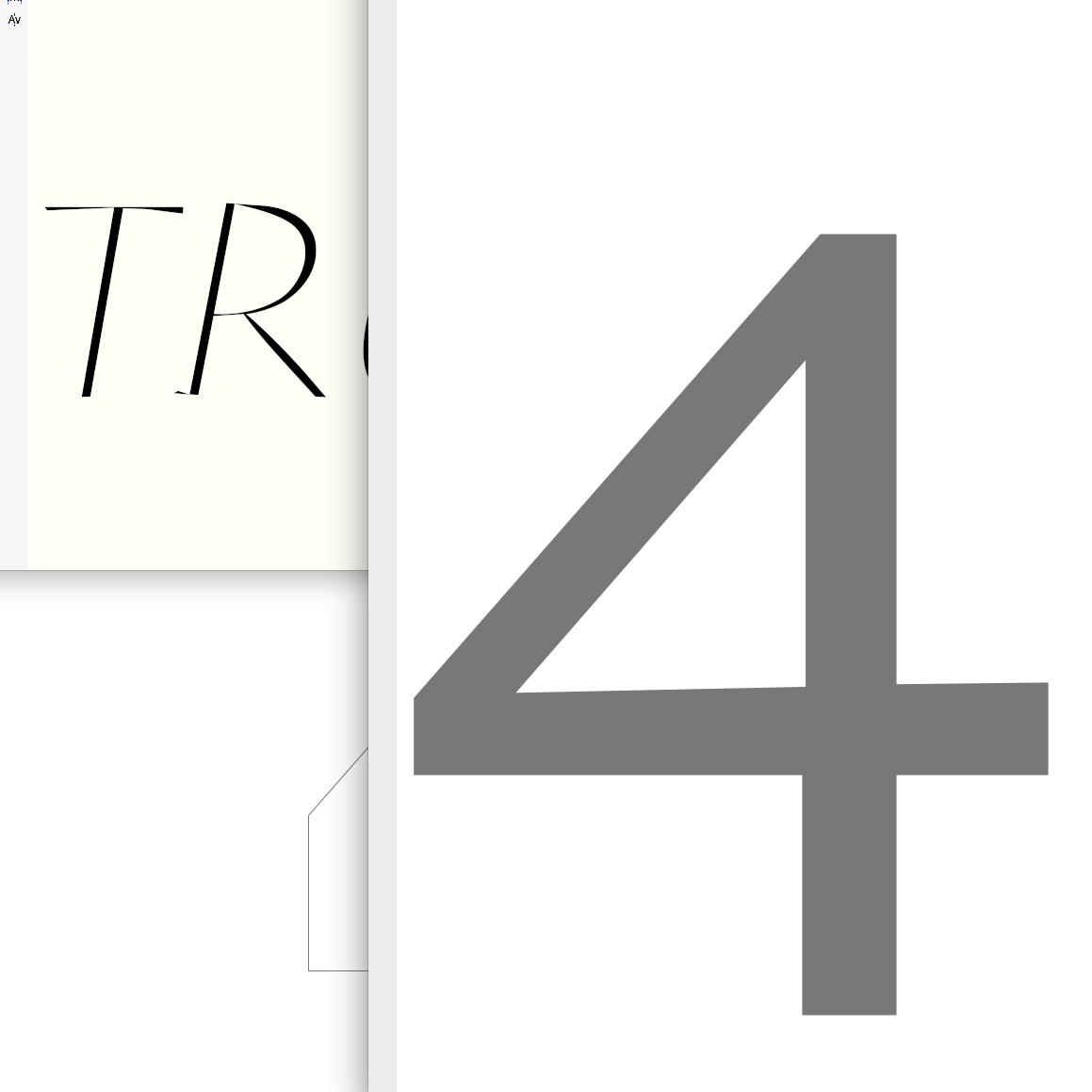
Image: Working on typeface Urbino Italic and Advanced numbers
Related article: Urbino for Trussardi
*More on here.
1 – I had the luck to work for some of the biggest Italian publicity agencies like or – mainly as a type director for special campaigns or Below the Line consultant.