
That’s why we (perhaps) love circles
 Signer Text Detail ‘S’ · ‘Sa’ Metrics Window
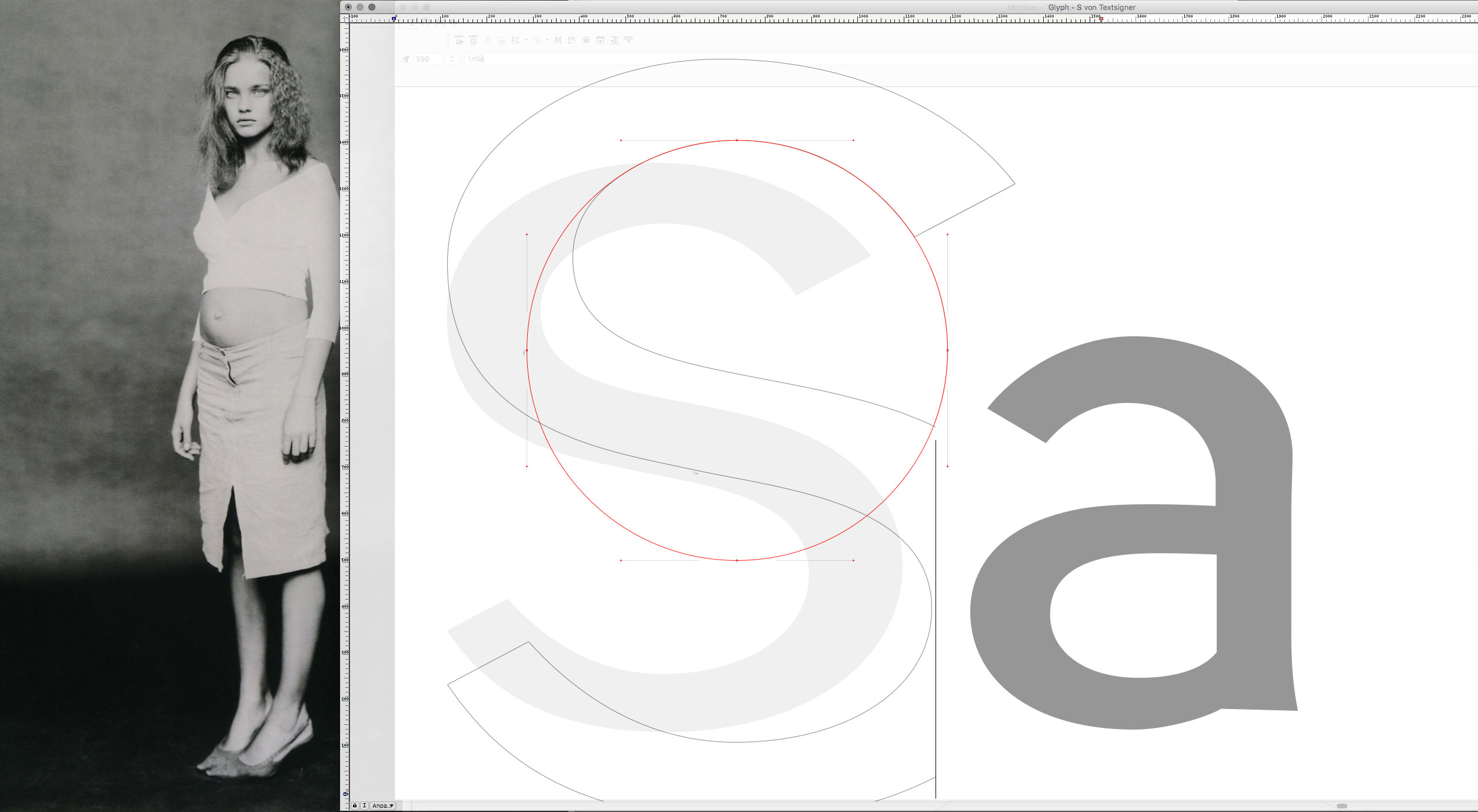
 Signer Text · ‘S’ Inner Circle
 Signer Text ‘S’ · Added Curve Point
As promised, I will publish some posts about the ongoing work on Signer Text. However, it is incredibly difficult, if not impossible, to present the work process in a truly didactic way. It is very difficult even for myself to keep track of what I am doing. The process is so very intuitive and must be based on something almost unconscious. Recently I saw a very interesting documentary about an American writer who once claimed that writing is the division into two parts: the work of a drunk, revised by a sober. I have a feeling that this is quite similar in the process of designing typefaces. The drawing process, which interestingly enough usually makes crucial turns and progress during the night, is revised and slightly corrected in the early morning.
Consequently, it is difficult to force oneself to jot down, to photograph ideas in this intuitive, unconscious, “drunken” phase. Nevertheless, I will try to reflect some thoughts and influences that push my letter images in a certain direction rather than another. In creating the Signer Text, I’m not quite sure yet what its destination will be, what I want to express character-wise. Certainly there is the eternal inspiration of the Franklin Gothic to achieve something truly elegant, classic, dynamic, but also stable and solid.
There is the eternal inspiration of the Franklin Gothic to achieve something truly elegant, classic, dynamic, but also stable and solid.
While drawing, I noticed that I seem to be following some symmetry ideas that are particularly evident in Signer. In the capital letter ‘S’, for example, I recognized the symmetry, the balance between left and right on the upper inner form under the “ceiling” of the top turn of the lettering toward the top. This seems to give the letter some stability. So I temporarily added a new intermediate curve point that almost perfectly matched the hidden circle, which of course I only had in my imagination while I was drawing. I added the red circle later to make it easier to understand. Again, I strongly believe that these ideas should not be slavishly followed during the working process, because that would prevent us from getting into that intuitive state of mind.
Since the , the circle has had a strong meaning. It is also a metaphor for stability, harmonious movement, and even something that, on another level of perception, signifies life itself. The beautiful 19-year-old , photographed by , might give us a clue. I put her on my desk while drawing, and as many, many years ago, she still inspires me. The rest is pure imagination…
Read also [German and Italian language]
Credits:
| Photography
| Model