
From a time when…
 se Vouer · Fashion Editorial
 se Vouer · Fashion Editorial · Caslon No 540 Italic
… we were fashion editor, casting director, photographer, art director, typographer and type designer all rolled into one.
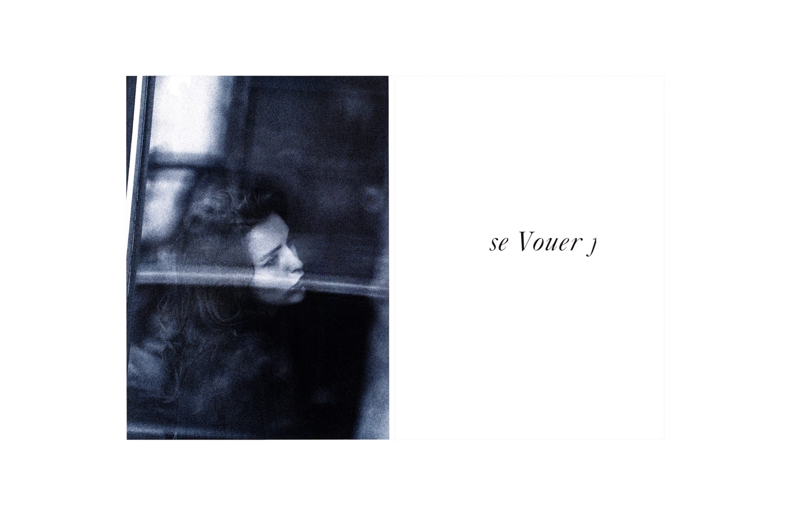
The story behind the “blue” photography was quite unusual and perhaps worth telling. I intended to photograph scenes of extreme elegance, and of course in Paris. But as a student I had no money, so I decided to develop a concept to photograph fashion on real women in the street. A kind of street photography, but with the ambition to make something very elegant.
So I spent 2 weeks in Paris (I settled on a campsite near the Bois de Bologne) looking for beautiful, well-dressed women. An endeavor that was not as easy as I had imagined. In order to take these kinds of paparazzi shots without a model, I had to remain unidentified. I used a 500mm telephoto lens with mirrors that allowed me to shoot handheld without attracting too much attention. For this, I used high-sensitivity 3200 ASA film material. In this way, I could shoot by hand and achieve exposure times of 1/250s or less to maintain focus. With a motor shutter, I took more than 600 shots (which was quite a lot at the time, since I was using analog film). Much of this footage was trash, but occasionally something really beautiful happened.
After I took a series of shots, the beautiful lady began to notice my uninvited presence. But perhaps she also saw in what state of arousal I was. […] She let me finish my work with indulgence.
However, the most amazing and exciting scene was this beautiful young lady sitting in a sidewalk cafe (I don’t remember where) behind the window, probably talking to a friend. I was so mesmerized by her beauty that I forgot everything that was happening around me. I stopped almost in the middle of a chaotic street with parked cars, passengers around me complaining…. After I took a series of shots, the beautiful lady (although I was at some distance) began to notice my uninvited presence. But perhaps she also saw in what state of arousal I was. For she gave me a beautiful but barely noticeable smile and continued talking as if nothing had happened. She let me finish my work with indulgence.
Later, in the dark room, I developed the coarse-grained film on hard photographic paper (AGFA barrit no 5 graduation) to make the grain stand out even more and achieve an almost abstract pointillism effect. Further, using a special chemical treatment, I changed the silver tones to a dark blue and experimented with it for almost 2 weeks. (At that time, you could hardly enter the lab at the university without running into me there.) In the process, I noticed that the grain was no longer as even. So I bought retouching paints in all shades of blue to gray, and with a fine hair brush I filled in the holes, at the same time scraping free the paper white in the condensations with a medical scalpel. This took me another 2 weeks. Extremely concentrated, almost meditative work. But I was completely in love with this beautiful face.
I decided to redraw a classic fashion typeface, Caslon No. 540 from , by hand to accompany my photographs. I enlarged the letters and drew them on tracing paper, which I placed over them. In this way I achieved a more beautiful and graceful typeface, especially by making the hairlines thinner. Then the letter images were zoomed out again with a reproduction camera and mounted on a transparent film, which was then deducted as contact under vacuum. The resulting text blocks or words were also exposed on AGFA No. 5 to achieve the absolute black on a brilliant white. According to my previous conceptual studies, I wanted the individual words (seVouer) to appear “cut out” of a text block surrounding. So I intentionally added partially truncated letters of the following or preceding words of an imaginary sentence.
One could say that the whole process was a very personal result of “se Vouer”: to dedicate oneself to something close to the border of self-sacrifice in order to represent beauty.
Credits:
| Photography
| Photography (reproduction)
Unknown | Model
| Model (legs)