
Working on Girl Editor for a Balenciaga lettering
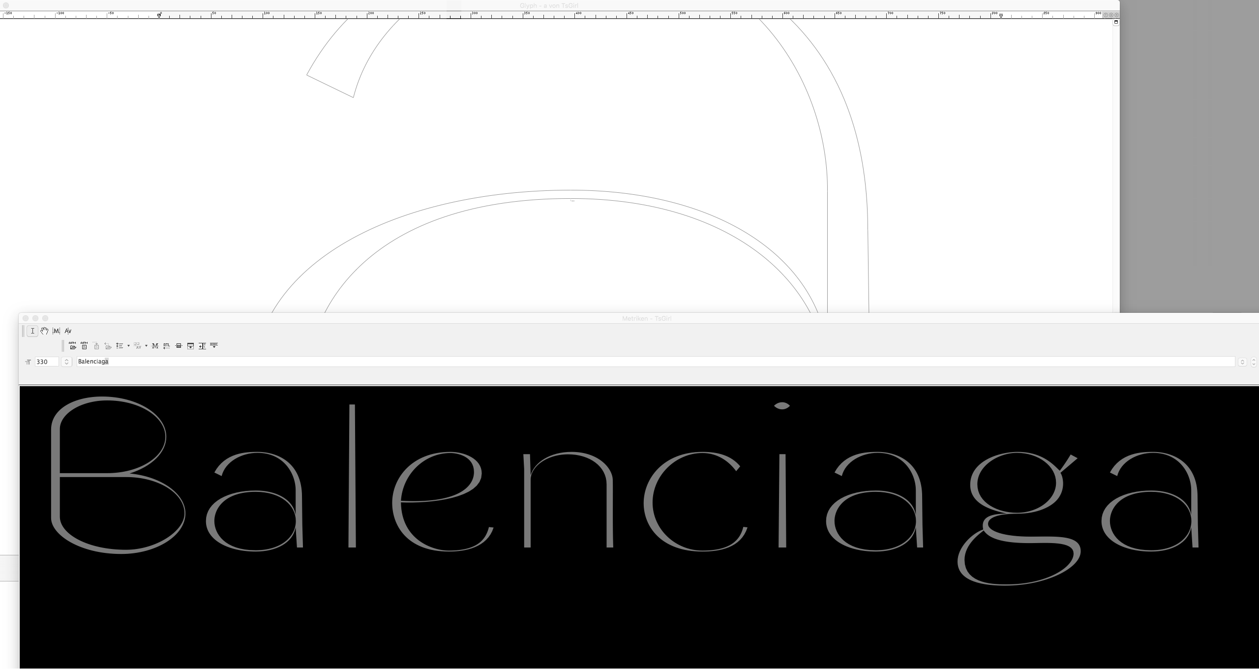 Girl Editor ‘a’ Detail · ‘Balenciaga’ Metrics Window
 Girl Editor ‘n’ Beziér Details
Recently I have been working on a lettering for . I had been inspired by those experimental looking magazine pages did in the late sixties for Vogue. used those extremely elongated semi-classicist headline typefaces even in italic variants. They look quite strange and somewhat unusual to modern eyes but if we look close they are not bare of fascination. Yes, as the word in itself seems to suppose: fashionable. Excentric.
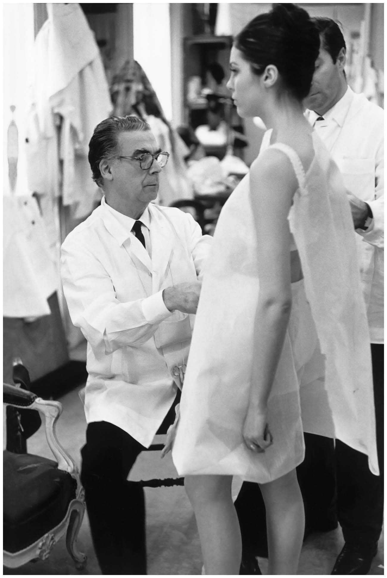
At about the same period the clothes of Spanish fashion designer were “en vogue” and many of the editorial pages speak about him and show his couture dresses that are surely not less daring experimental. A couple that matches. From a type design point of view, however, this is somehow hard of an excercise. The name is extremely long, set in an wide character with thin hairlines and harsh stroke contrast. This intrigued me.
In a certain way the great Spanish couture master acted like a type designer himself. With the utmost scruples taking care of the perfect fit, specially there where tailored forms intersect with the female body.
I decided to re-work on my Girl typeface. Some letters were needed to be adapted in size as I left them in the early 2000 years incompleted. I had some beautiful ‘n’ and ‘m’s with subtle details as broken stems and slightly curved straight lines. The ‘a’ was needed to be re-done.
I wanted to keep the experimental spirit using large ellipsis as counter forms, but at the same time I surely am type designer enough to give them what someone may call the forms of a “real letter”. Because it is often that you do quite easily a fascinating graphic form which however lacks the fluidness and organic quality which makes those forms fit together in a line. Which enables them to attach one to another, chains them together. A quality which is hardly explainable but comes from a long experience of looking on historic typefaces and semi-calligraphic forms.
These are images from a first stage of Girl Editor (re-)design which show some adapted letter forms and the new lowercase ‘a’. There is still a long way to go…
Read also
See on Letters (stefanseifert.com)
Credits:
| Photography (small)