Advanced
Category : Exclusive Fonts, Modern
FRAGMENTS
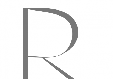
Some layouts and researches that I have done together with the design process of my Girl character. It is a quite extravagant typeface that was inspired of some of the Spanish fashion houses’ Haute Couture dresses of the fifties and sixties.
It combines the extreme contrast of stems and hairlines in its letters with a more wide but still Renaissance like shape character. It reflects a striking juxtaposition of classic design with highly modern elements.
The lowercase letters of Girl typeface were added only many years later. Other fashion griffes’ researches were done like this one for example.
Credits:
, | Photography

Girl · Letters

Balenciaga Lettering · Typeface Research
Very often I find #inspiration for particular letter forms in the female body as in these examples it was beautiful Natalia Vodianova in a fashion shoot of Italian photographer .

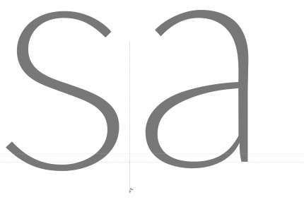
Working Situation · ‘a’ Metrics and Drawing

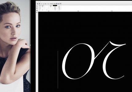
Girl ‘g’ · Screenshot During Drawing Process
Shadows and lines formed on the surface of the skin sometimes give very similar impressions to outlines of characters as a result of an inner structure given by muscles’ and bones’ structure in the human body. The extreme contorsion of Natalias body here helped me to better understand what was going on in my ‘g’ and in the same time just delighted me to keep on working.
Read also [Italian and German language]
Much time was dedicated to the subtle process of giving the right letter spaces.

‘ryo’ Lowercase Letters · Spacing
Es ist schwer auszumachen, wann genau sich in einer Schrift all die Feinheiten auf genau die Weise, auch in den winzigsten Details, zusammenfügen, wie sie es selbst bei einer schönen Frau nur selten – etwa bei einem auserwählten Topmodell – der Fall ist.