FRAGMENTS

Advanced is the name of a regular text and titling typeface which has some slight remembrance of Franklin Gothic and other classic sans serif typefaces. It is fitted for flexible use containing ultra slim versions as well as tiny 10px size fonts specially adapted for use on monitor. Major focus was also pointed to negative versions on black ground for sub pixel rendering environment as well as retina variants. Find here screenshots of work process and explanations of different versions.

Advanced Letters in FontLab Metrics Window
‘33’: Threeadvanced Sub Pixel · Threeadvanced

Threeadvanced Letters: for Small Sizes on Monitor

‘84’ Threeadvanced Sub Pixel Counters and Detail Treatment
The so called sub pixel rendering is a special technique that optimizes font rendering on monitor which makes, said very simplified, use of inserted different colored pixels within the antil-alias zones of each letter which makes it for the eye appear more sharp that it would be with the solely use of grey shades.
It was for a long time a common issue (nowadays becoming more and more obsolete through the elargation of retina screens, which gives the designer the option to renounce sub pixel rendering at all) that particularly in very small font sizes and used in negative (so white on dark or black background for example) those fonts tend to look very bold, somehow “swolen”.
The sub pixel version of Threeadvanced (monitor font of Advanced) avoids this problem by serving an additional slim version of its mother font through CSS queries which is basically an identic font family (with unchanged spacing and width settings) containing extra slim designs of each letter. Those designs have added particular detail treatment within the zones where letter forms are connected which is a quite similar technique to certain photo setting methods of the long gone past where such extra narrowing of lines near to its connections at stems for example avoided the exagerated amount of color in certain areas of the letter image. So that the final result of such a font is solid in structure with sufficient weight for being well readable in tiny sizes but also without the swolen “extra bold” effect.
Another feature of this particular variant is the slightly more accentuated elaboration of pen stroke effect. As for the “bold” extra adding of color through sub pixels is a mere “physical” process than an intentionally designed one it is percentually resulting more evident on thinner lines than in stronger ones. The slim lines of letters therefore have to be kept thinner regarding proportion to its thicker counter parts in order to give the same impression of form character as had the original font. So with one word the pen stroke effect tends to become more evident in these sub pixel prepared designs than it would appear in the normal letter drawing.

‘ASa4’ Advanced · Metrics Development
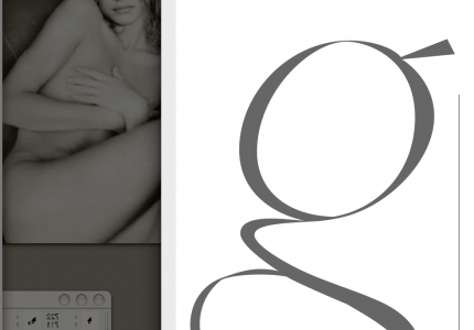
In 2018 I decided to reduce the text character’s display of my personal website (www.stefanseifert.com) to one singular font called Threeadvanced (Revised). I simplified many of its letter shapes as the ‘g’ and others.
Its overall character has become slightly more geometric adapting it to the taste of our time. However, I preferred to leave it as a non modular typeface using different almost hand drawn like shapes instead of copying its curves into the different letters.
It is meant to grow over the time and I do continuous modifications on its letters recently also taking more care about the capitals.

Threeadvanced Revised 2018 · New ‘g’

Threeadvanced · Very Early Version (Photo by )