
The Dark Forms
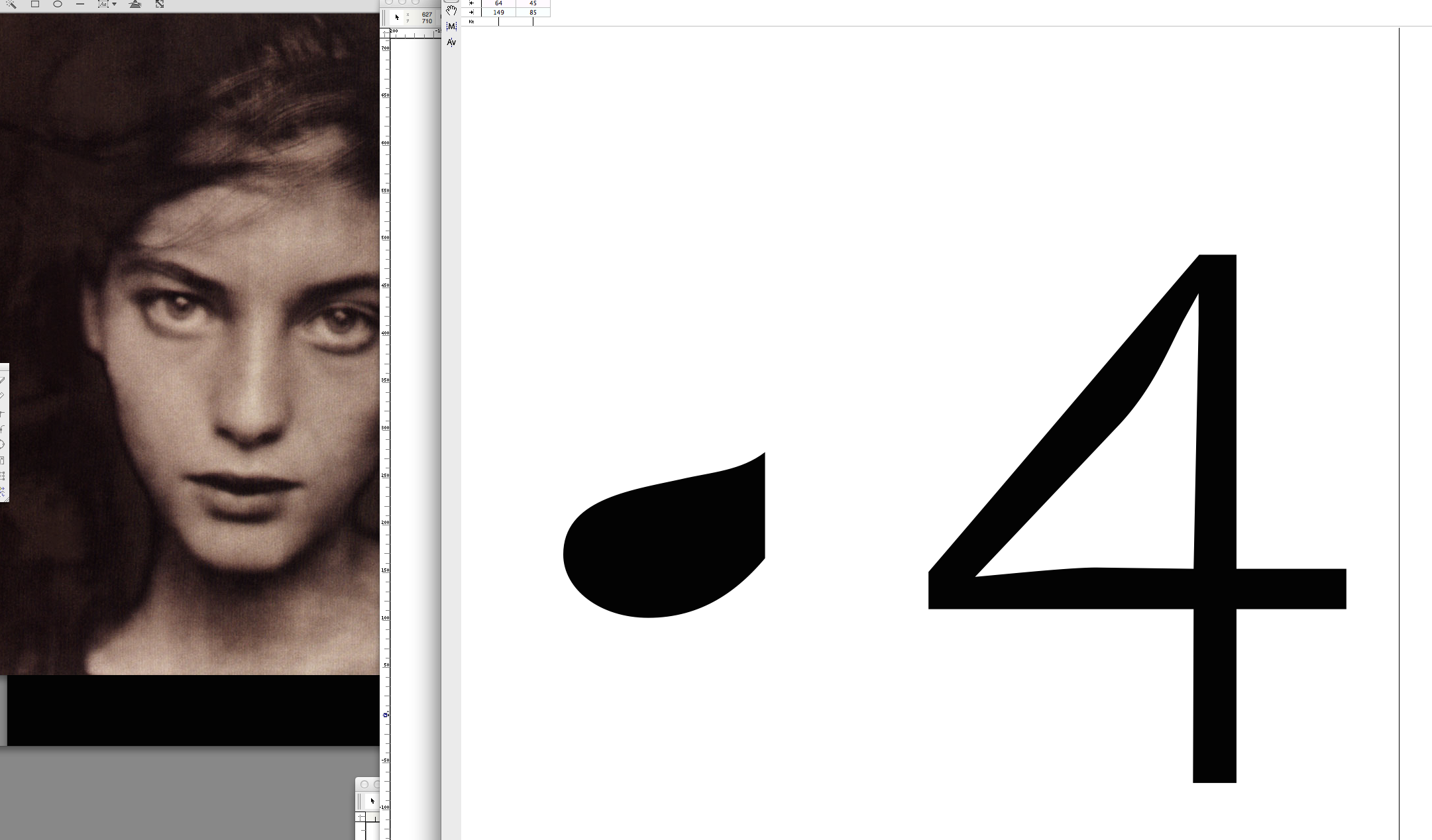
I enjoyed working also on something that we could call “dark forms” when I did these sans serif letters. In order to make our letters harmonize in details we may also compare parts of their forms that we wouldn’t usually take into account as I did here with the inner bowl of the ‘a’ and a “straight” stroke in the number ‘4’.
This is an exaggerated example, of course, more an experimental study but it may show that designing typefaces has many hidden aspects. And, if we want to make our letters lively and special we may consider and lay more weight on those aspects. Just as it seems the photographer () did here by emphasizing the dark background forms enclosing this beautiful woman’s face.
Credits:
| Photography