
All Those Numbers
Once a professor of mine in university said to me about typeface design: “Did you know that the most difficult task in designing typefaces is that of drawing the numbers?” This remark clearly aimed at pointing out that I was about to touch a field of design that would have its own mysteries and, besides, was definitely not very much supported by the concept of our institute back in those days. In other words some kind of a warning (I laugh) that should point out that I wasn’t very prepared for this task (which was definitely true) and better should leave my hands off before getting into deeper trouble.
Well, the troubles I took into account and I definitely had my fair share. Which means I was fighting the rest of my time in university to make type design my favorite branch and bending all their tasks that they gave to me to make them head in that specific direction. And as if this kind of ‘dark’ reminder was an additional incitement buried in the back of my mind, I always find myself focusing a lot on the design of numbers when I am beginning a new typeface.
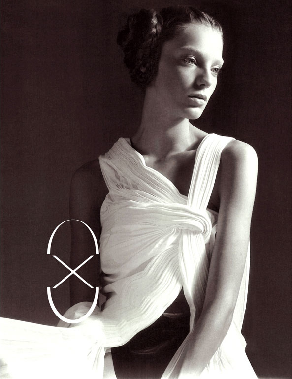
So over the years many of my font creations always had complete sets of numbers while often leaving blank spaces in my font charts, namely of many letters that didn’t interest me very much. In particular, my more experimental creations have stylish numbers sometimes on the brink of readability, I admit. The one above is number ‘8’ of a character called Romantic after a story in and had numbers consistent of exclusively crossed straight lines and a singular curve shape. It matches the dress that served to me as an inspirational fountain.
Credits:
| Photography