
Between Naturalness, Terribleness and Sweetness
 Signer Text ‘9’ · Counterform
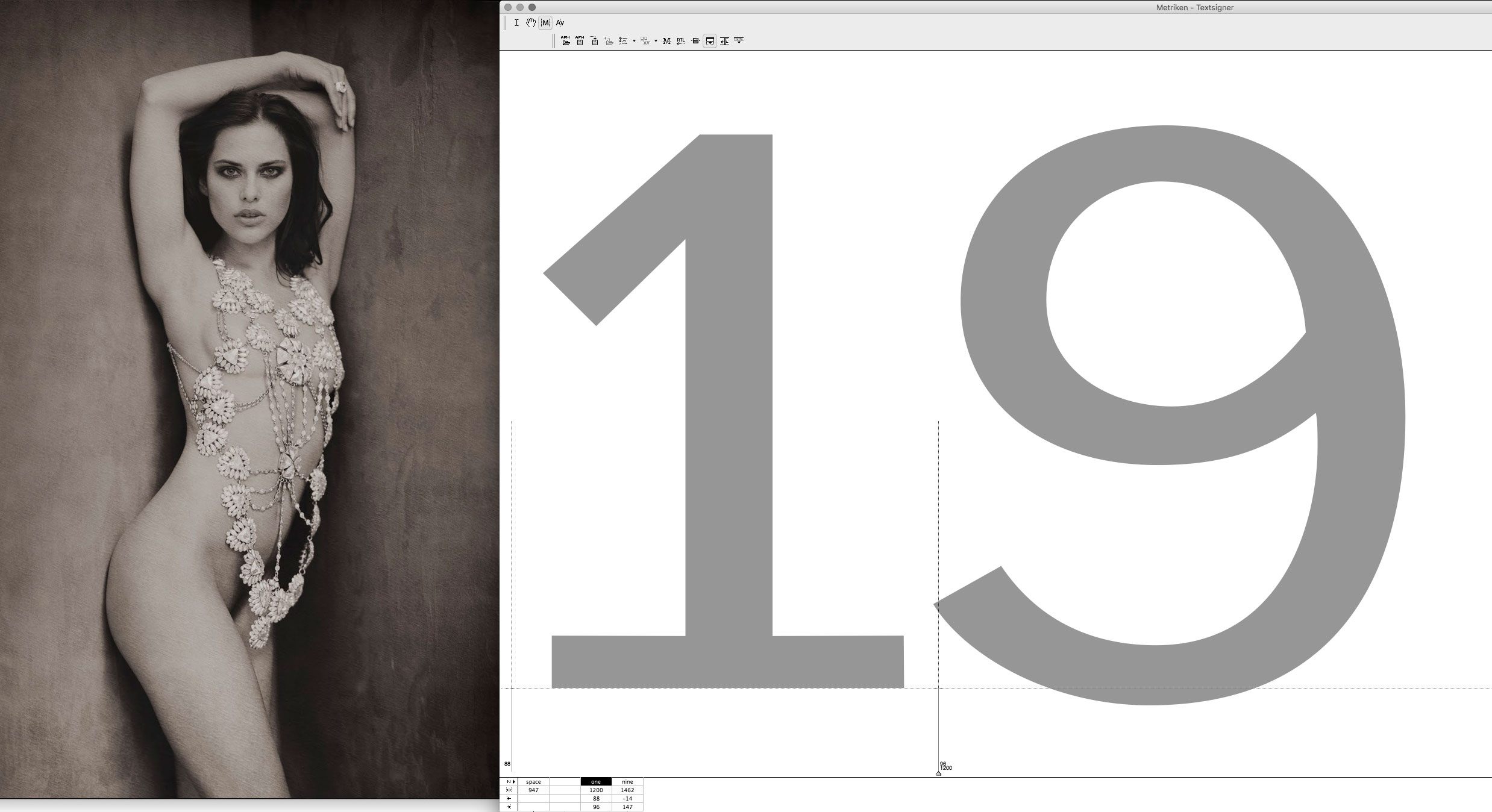 Photography · Work on Signer Numbers
Today, next to my morning cup of espresso, is a small opusculum, first printed, it seems, in 1949. It is a small monograph on the Centaur typeface by . My friend Chris Wakeling, an excellent English printer, sent it to me. And again, it makes me philosophize about that love of printed letterforms that I still love so much and that has been with me through all my life’s circumstances. It’s such a pleasure to look at these shapes, once so carefully drawn or engraved by hand, or more recently created digitally on a screen. And I still wonder where they came from, what it is that makes them shine so mystically for me.
It’s no longer a secret that I draw my Bézier lines inspired by the shapes, curves and lines of the female body. It is something like a game between many factors. In a book about , the Italian Renaissance painter, I read about these influences in terms of “Naturalness”, “Terribleness” and “Sweetness” that the artists of those days struggled with, to tend to either one side or the other. And I think it’s always this that shapes our designs. On the one hand, admiration of nature: how it creates “outlines” of forms guided by an inner structure, like the curve of a leaf or, yes, the beautiful sinuous lines of a female body, conditioned in themselves by bone and muscle. On the other hand, there is also a certain will to achieve an ideal form in the sense of geometry. Our eye loves it when things become symmetrical or oval shapes become perfect circles. Because, as often said, it was this striving for perfection that pushed artists to their limits. Bones and muscles, extreme bends and perspective forms were called “Terribleness”; “Sweetness” was the opposite, that is, the willingness to refine the created forms so that they became almost artificial, self-sufficient and praising more the artists than their own origins. And finally, there was “Naturalness”, which can be described as a successful balance between these tendencies. Creating forms that show their original principles, movement, strength and organicity, but without exaggerating. A balance between brutal structure and sweetness.
We wrestle with the structure and pressure with which the pen put its forms on paper, and the will to find in their inner and outer forms something that tends to be geometric, ideal or perfect.
I have always thought that this also applies to the forms of printed letters. When we draw their outlines “artificially”, imitating a calligraphic form once written, we wrestle with the structure and pressure with which the pen put its forms on paper, and the will to find in their inner and outer forms something that tends to be geometric, ideal or perfect.
Above you can see some pictures of the process of creating Bézier curves for my font Signer, which is meant for text sizes. For inspiration, I used the beautiful photograph of on my desktop background. When I drew the curves of ‘9’, or rather corrected what I found when it was systematically derived from the very thin original shape, I especially liked the connections of the bowls. It reminded me of such shapes as we find in the movement of a shoulder, which lets us see clearly what forces are at work here to bend muscles and incline bones before they form the curves of their surface on the skin. I liked the way the lower part of the hairline enlarges before dipping into the main oval on the right side.
But at the same time, almost unconsciously, I became aware of what was happening to the inner shape, the oval enclosed in the eye of the character, the so-called counter. I tried to round it softer, to get it closer to a circle (read also the previous post why). In a word, I was getting dangerously close to the “Sweetness”. The softer and rounder our counterforms become, the more the letter as a whole loses its structure, its stability guided by inner forces. The female body itself is the perfect example of this precarious balance. So when we draw in reality, we are always struggling, once approaching one side and then perhaps returning to the original principle. Yet the human body, at least to me, is the crown of these principles. Because when we create something, we may want it to be similar to ourselves.
Credits:
| Photography