
Magazine Double-Pages from My University Archives
 Lay Lady Lay · Magazine Layout
 Lay Lady Lay · Magazine Layout
 Lay Lady Lay · Magazine Layout
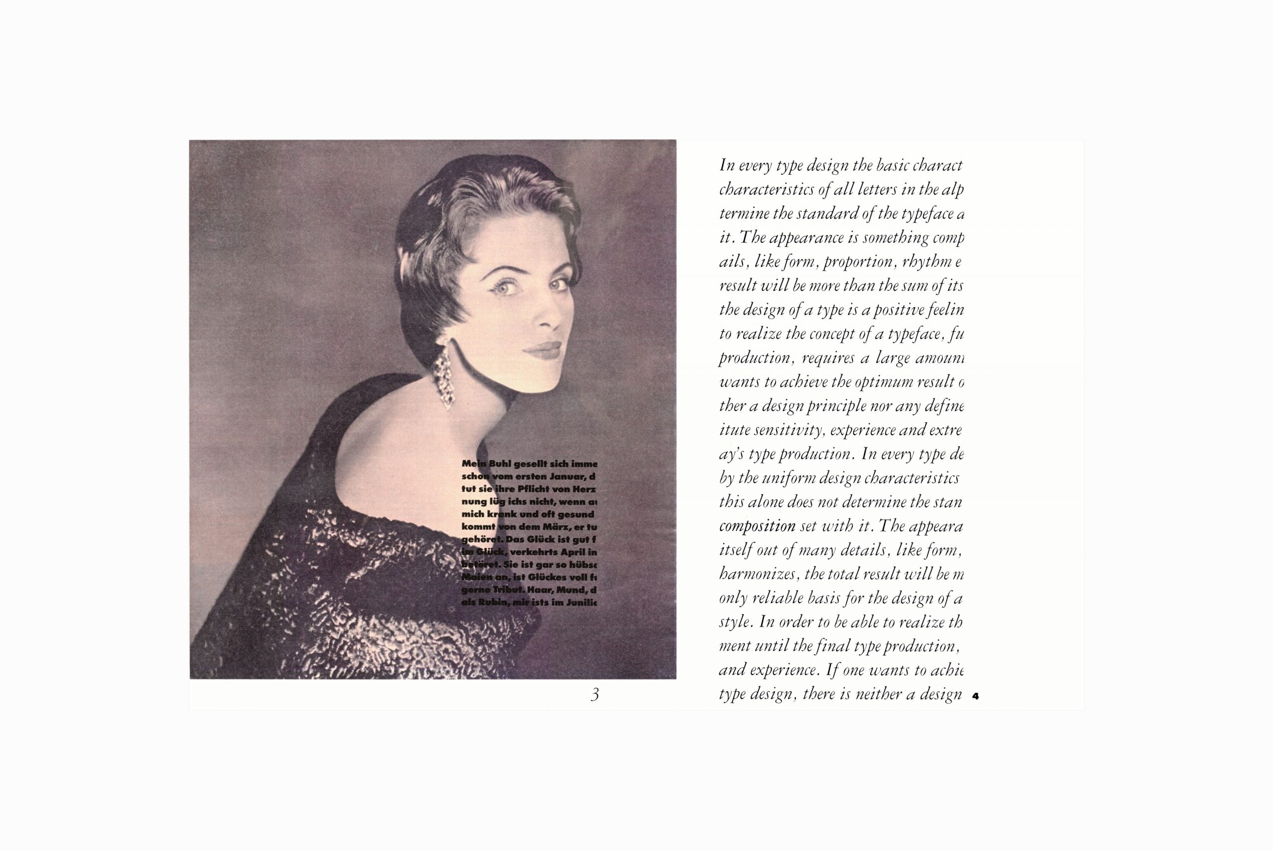
I remember cutting out these beautiful cursive text blocks in Garamond (No. 3) from photographic enlargements made with a reproduction photo camera. It took me a while to arrive at these seemingly simple layout solutions. Purely composing like a painter, with text instead of color and form. The image overlaying text blocks were enlarged and developed on transparent film material, which I carefully mounted over the color photocopies of those wonderful photographs I had found in an antiquarian bookstore (and with whose long-gone beauties I had literally fallen in love).
In those days, there was a lot of work with scissors and montage, which in a way forced us to think about typography differently than we do today.
In those days, there was a lot of work with scissors and montage, which in a way forced us to think about typography differently than we do today. This had a lasting impact on my way of perceiving sets of text, which in turn seemed to be woven from excellent (phototypesetting) typefaces as if into a tapestry. Flipping through my old copy of Printing Types, Their History of Forms and Use recently, I suddenly realized that what I was doing resembled what the old printers of the 15th century produced with text as form, compact and as the purest element of composition.
Only later did I begin to discover what and were doing for the famous fashion magazines. I’m still very interested in magazine layout. Although, well, I would do it differently than what I see in most magazines today. I would go back to composing with text….
Credits:
| Photography
| Photography (reproduction)