
What happens if you get influenced by Spanish type?
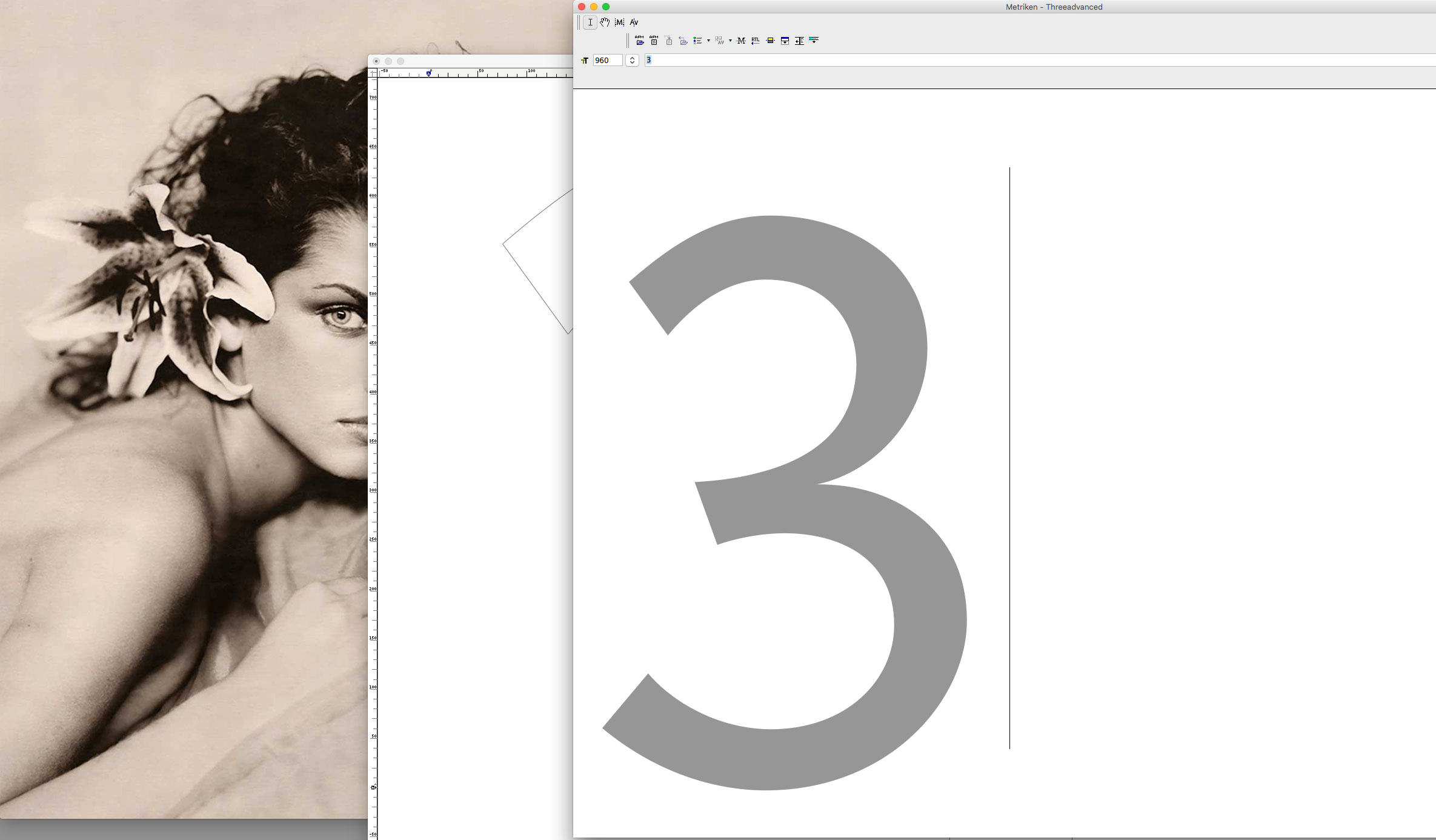 Threeadvanced Number ‘3’
 Threeadvanced Numbers ‘37’
 Threeadvanced ‘3’ · Bézier Curve Details
During my recent researches for the Girl character involved in a Balenciaga lettering it happened that I woke up in the morning for my early espresso coffee studying historical Spanish typefaces. Which we all know have a very special and distinct style. They stand out in the history of the evolution of printed typefaces right from the beginning in the early 15th century.
At the same time I was using this beautiful photography to inspire myself and compare the forms that I was trying to refine for my Advanced Sans Serif typeface. This girl has this beautiful flower at her ear and I thought: Well, this could be it. It is kind of a “flourish” element that those early (and later) Spanish type-cutters added to their letters. Where others used flat serifs or rectangular stroke endings the Spanish typefaces used to do add little curvy lines, sometimes a little curlycue here and there.
It is about something deeply rooted in their cultural story.
But, it’s not that their typefaces simply are decorative. Because they aren’t and it would be a great injustice to say so. Because this would diminish their effect, the class of their own they have. It is more about something deeply rooted in their cultural story. Recently I also watched old photographs in a book about the early Bazaar years (to see style) and there was this photo of a beautiful young bullfighter woman with a hat that almost seemed part of a costume typical for her profession. There were strange looking ribbons folded like leaves on its top, kind of curvy and playful. Because, if we are honest, not one flower would have a straight line in its shapes. All was in tension, yet wounded around its axis. But, just like in this Balenciaga hat which had a strict circle, almost stiffy base form what happens to make those Spanish forms more than merely ornamental is their juxtaposition to at the same time rigorous geometric principles.
They aim for the perfect circle and in this they are more than most of all other typefaces near to early Italian Renaissance spirit.
This is what I also see in Spanish incunabula typography. The tendency to allow those decorative elements but melt them with severe classic constructive principles. To say this more simply: they aim for the perfect circle (within this lies the simple secret of #beauty) and in this they are more than most of all other typefaces near to early Italian Renaissance spirit. There is nothing of Baroque in their forms. Ideas that later on would have done so much harm to the best principles of printing types!
So, I worked on with my Advanced typeface numbers. I am already in a phase were I am not willing anymore to do great changes (so tiresome achieved an overall balance) but I almost unconscioulsy (the fact that I am writing about, I guess, proves that not so unconscious) reviewed Bézier details on the stroke endings as here in the ‘3’, added an inclined ending on the upper ‘7’ horizontal and others.
It is quite interesting that the slightly more decorative stroke endings and conjunctions which tend to close the counter forms a little bit more, in this tend to support the mentioned circle ideals instead of doing harm.
Subtly, in that way I enhanced the calligraphic principles, slightly opening the endings (like a flower) and at the same time refined their inner forms a bit to achieve cleaner circles. And it is quite interesting that the slightly more decorative stroke endings and conjunctions which tend to close the counter forms a little bit more, in this tend to support the mentioned circle ideals instead of doing harm.
I knew that this inconspicuous play with details would lead me to change many of my letters, seek again for their subtle tension between geometric inner form and calligraphic endings. Nevertheless, I decided to let it happen. Because, in the end, I always had a soft spot for those Spanish typefaces. ¡Olé!
Credits:
| Photography