
Metamorphosis
One of the most difficult tasks any type designer has to deal with, for one reason or another, is deriving different weights for a type family. In my particular world of type design, it’s usually a matter of taking my original designs, which are often extremely thin and detailed, and creating a typeface for smaller reading sizes.
I’ve always envied the type designers out there in the professional type design world who seem to just use some sophisticated technical systems and programs to do it. That may be, or rather, it is most likely a mistake to think so. For me personally, however, it’s tough stuff. I would go so far as to say that it’s like designing a completely new font – again.
I would go so far as to say that it’s like designing a completely new font – again.
The first difficulty I run into is the large amount of time that has passed, in most cases, between the time I created the first version and the time I decide to go with the text variant. It’s incredibly difficult to dive back into an original idea you may have had years ago. It takes quite a while to understand its specificity, its inner character. Although it may seem from the outside that my designs all have a kind of #handwriting, a similar touch, that’s not the case for me. Even if I start switching from one typeface to another only after I’ve been working on it for a while, when I take a quick look around, say after a week has passed, the older typeface has already become “strange” to me, a kind of foreign body. This is because really every single font has its own personal character, like a child that has grown up under your careful observation. It has its own way of being, reacting, getting into a flow between individual letters, and so on. Axes have a slightly different inclination. All these details, which we hardly notice consciously, adjust instinctively over time. I say unconsciously: at least that’s how I feel.
Speaking of details. It’s mostly these that make it a whole new task. We can start with some font program automatism as deriving mechanically weights. First of all, if we want to make a typeface with more weight that is easy to read at smaller sizes, it needs to be larger in rhythm and bolder in stems, but not uniform. I usually give much more weight to the horizontal direction than the vertical. This is because most letters have their hairlines on the horizontal axis. does this with what are called Actions that you can apply to the whole character. In a second step (which is a bit annoying), you need to fix all the rotten connections between the lines that merge into stems, etc.
If you are creating a text face from an existing font, you may also want it to retain some features of the original. You can’t do this 1:1. Some details have to be lost as the stems get bolder and they no longer make sense or would disappear at a smaller scale anyway, others have to be exaggerated for the same reason so they still stand out.
It’s funny, but some of the idiosyncrasies of an original character you don’t get to know until you try to create a new variation of them. It’s like leaving a person for a while and then returning to them to discover their peculiarities in behavior, their hidden weird little edges that you may not have noticed the first time around, or only noticed at first glance and then forgot to see them after you dived deeper into their personality.
In a word, what we are trying to do when we create a new weight is a kind of metamorphosis in progress.
In a word, what we are trying to do when we create a new weight is a kind of metamorphosis in progress. Partly controlled with the help of the techniques of type programs, partly unconscious, instinctive, as we begin anew to draw lines, curves and details. I’m usually fully aware that this task will take me a very very long time, although admittedly I cheat myself every time by telling myself, come on, it already exists, it can’t be that hard to make a version for smaller sizes! Yeah, if I didn’t do that, I probably wouldn’t even start. Because there’s still a long way to go, a kind of journey that will take us to places we might not expect at the beginning. In the end, it is also we who will be transformed. Both the designer and the creation go through this magical metamorphosis.
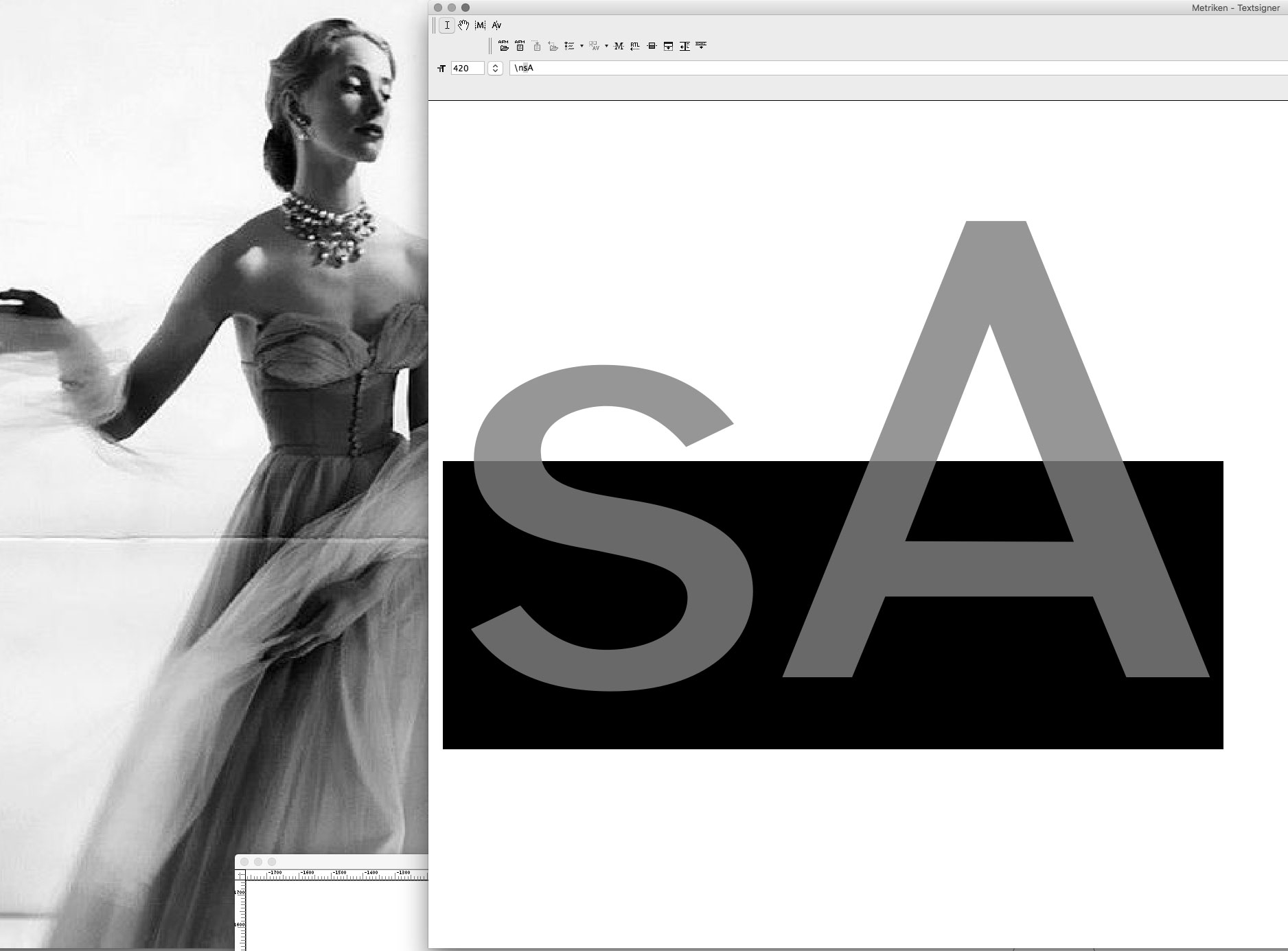
Above, some of the “new” Signer textface letters in their infancy. I promise to try to go deeper into the details of the working process in the next posts.
Credits:
| Photography