
Advanced, The First Sketches
Often the design of a new character begins with something as imperfect and, yet, at the same time so beautiful as the human body.
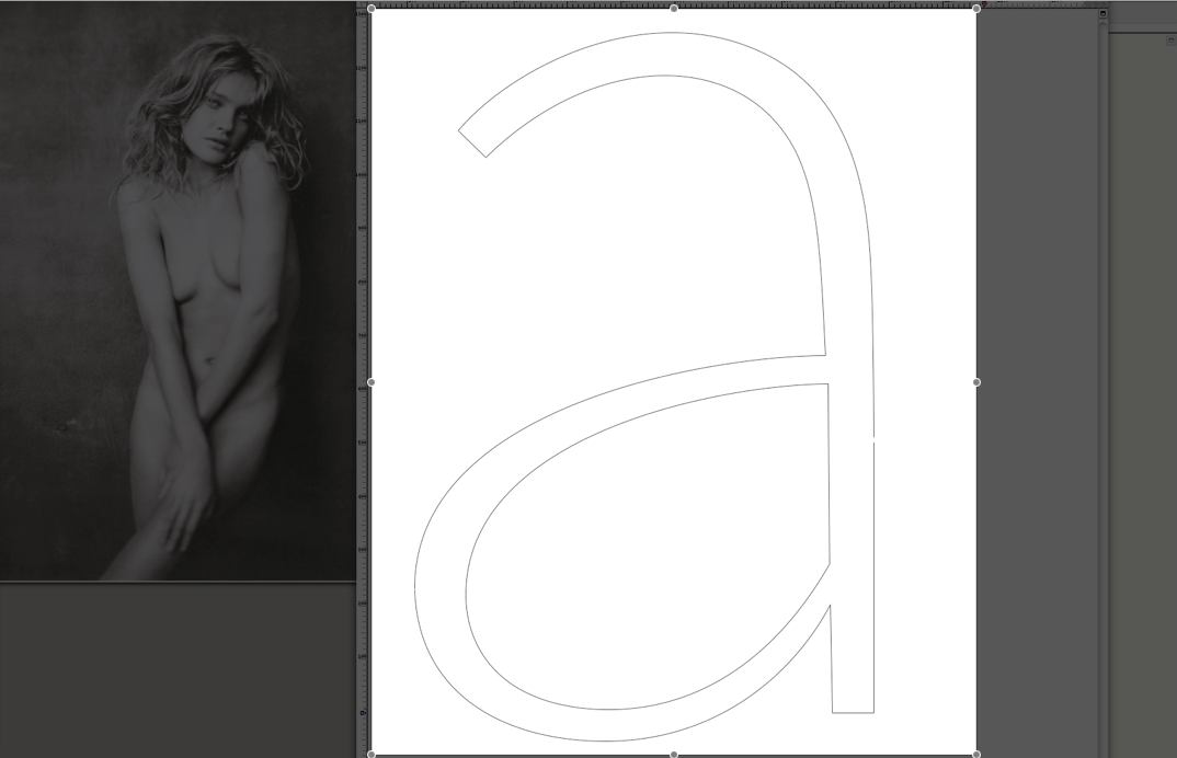
This is one of the first drafts of ‘a’ of the Advanced font. It is no secret anymore that I am a great admirer of photographer , especially for his collaborations with Russian supermodel . They seem to have something like a really intimate relation ship how it rarely happens over such a long period of time between an artist and his muse.
For me both of them are often vital when it comes to helping into life my new letter forms. I experimented a lot with simple Sans Serif text fonts that should keep some of those fragile and sensible aspects that occur in the game of bones and muscles in the human body and which is so hard to achieve with curves without them looking clumsy or just badly drawn.
Credits:
| Photography
| Model