
Alternative Letters
For every type designer, I guess, it is tempting to do alternative letters for his fonts. Sometimes during the development he might encounter nice ideas for certain letter forms he is quibbling about. And even if in the end most probably many of those will be neglected it is sometimes nice to look back at them and think by yourself “Wow, this one wasn’t so bad, also!”.
That’s because design is always also a habituation process. You draw and work over certain lines until you get so familiar with them that any other possibility, once easily scratched, fades away in comparison. While, in general, I guess this is a good process because – even if “narrowing our view” in a certain way – it sharpens our design idea. You need the courage to abolish certain forms to make your alphabet grow in a reasonable way. But as we are speaking about the mysterious world of creativity we might also say: “Damn this whole thing, I’ll keep them anyhow! Just because … I don’t know why.”
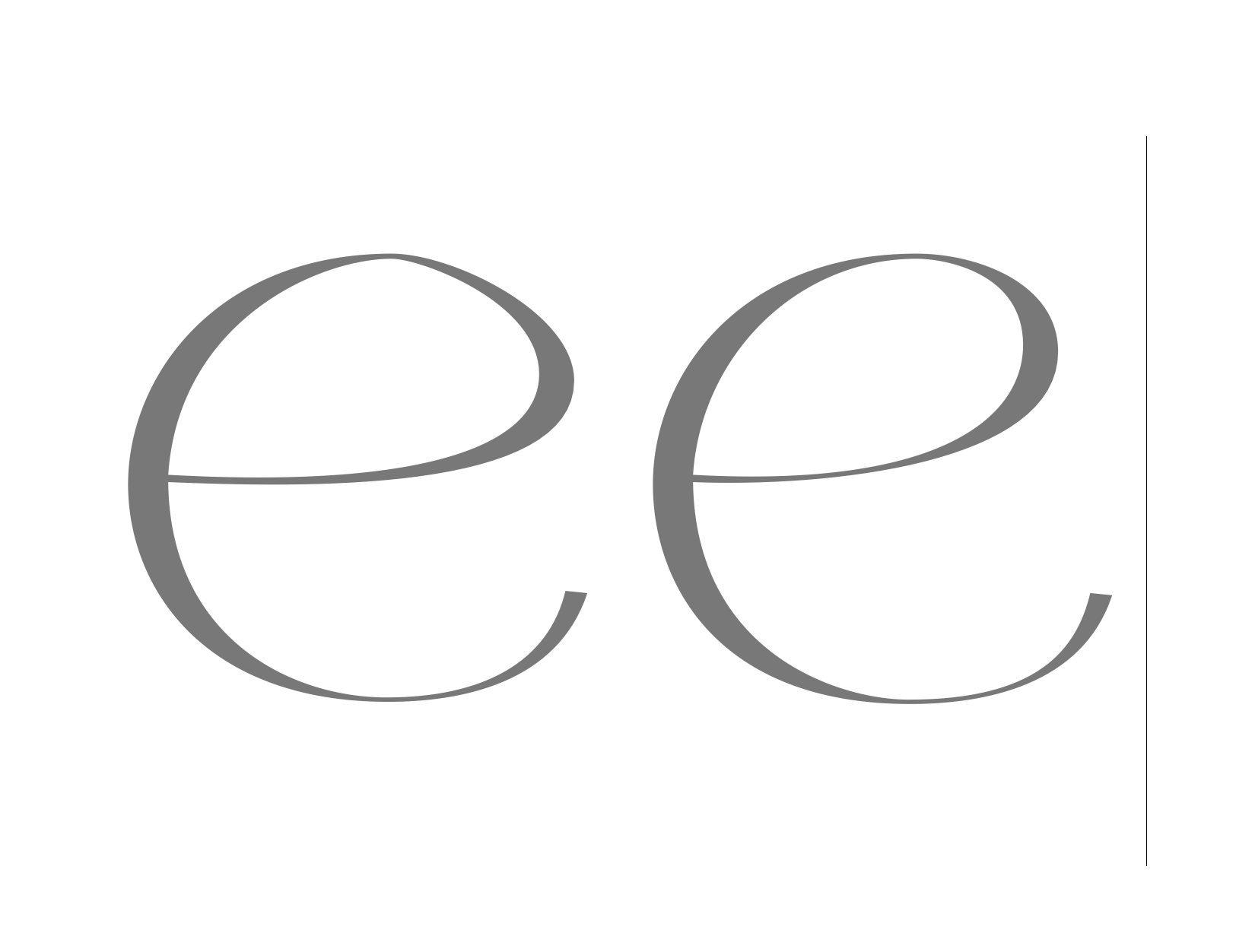
Above two alternative ‘e’s from Girl character which both did not make their way into the final font.