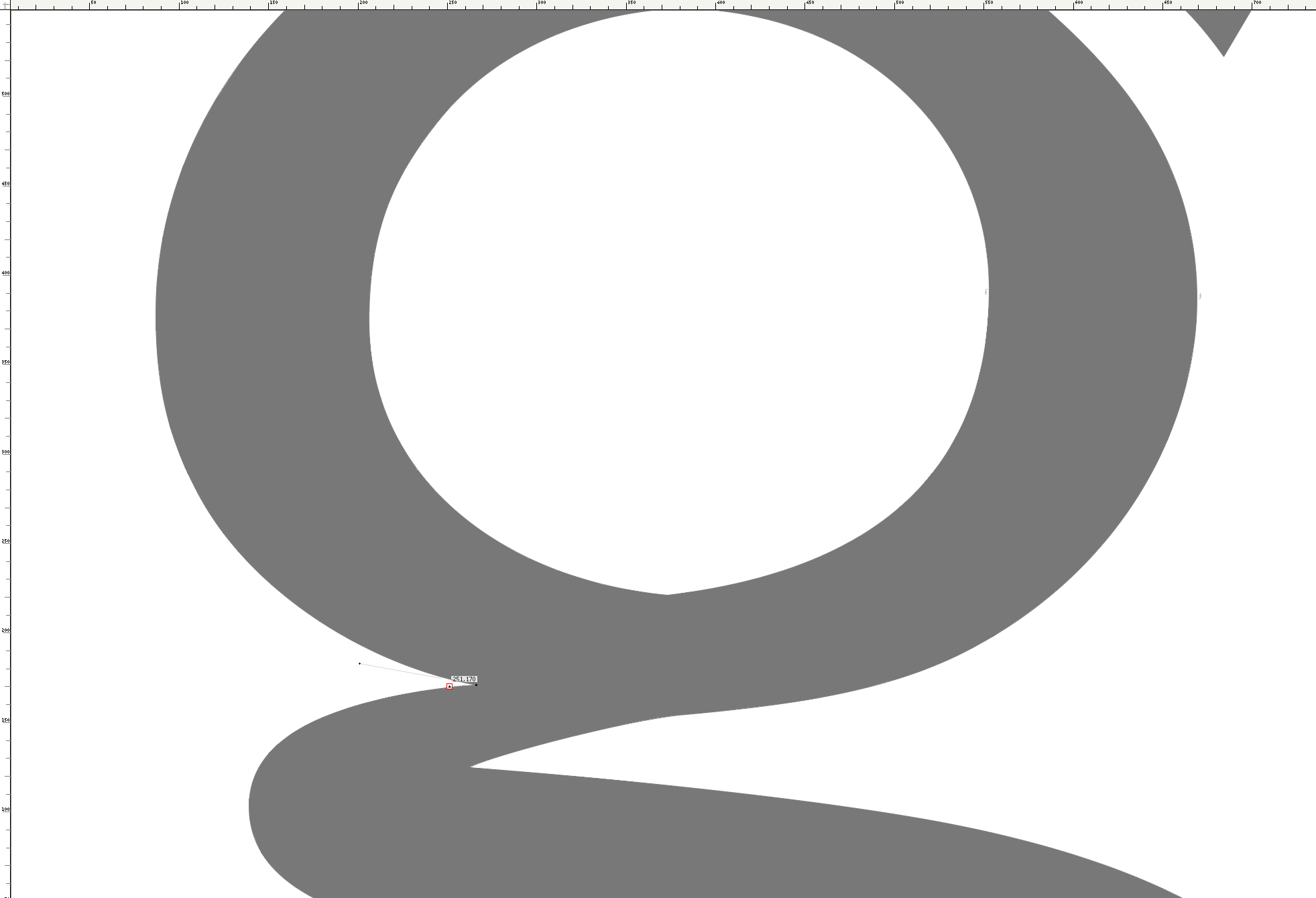
“All The Old Fellows…
… stole our best ideas” was the famous phrase by , American type designer in the early past century. What he meant was that many of the solutions we find for certain letter details or else may not at all be so new and already used by some type designer of the long gone past.
I remembered this phrase (and the beautiful book that I have in my office about this celebrated personality in type design history) when I was working on my ‘Advanced’ webfont. I struggled quite a bit to fit my rather compressed ‘g’ with a more dynamic appearance as it seemed for a long while now to lack the right connection between the upper bowl and the curve below. What I finally did was to implement this sudden break point in the inner oval. Not a new invention as it is nearly the same that another of my heroes of the past did in one of his typefaces. Namely, the sympathetic and his Centaur typeface.
It is in fact not quite clear if whose original Roman typeface has been the base for design really designed his ‘g’ or better struck it into his metal punch with that little ‘notch’, but it is certainly one of the most charming details of Centaur and in addition a superb means to underline its broad nib character.
I was happy with my solution (who knows for how long…). And it, by the way, reminded me to liberate myself sometimes from the monitor and open a good book once in a while. What do you think?


