
Webfont Rendering
 Original Text at ‘17px’ Size
 Pixel Rendering Detail
 Identical ‘e’s · Different ‘s’
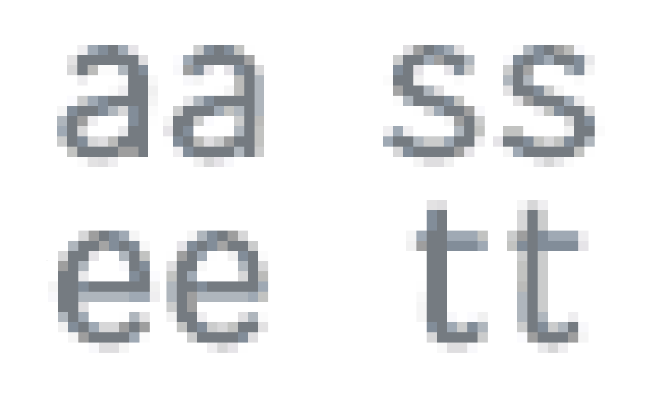 Rendered Letter Images’ Examples
As I was recently working on my typeface called Advanced in text size version for use on www.stefanseifert.com I encountered a strange phenomena on browser what concerned its rendering on monitor. I was occupied with defining spaces when I observed that some letter combinations had awkward distances while being rendered not even in too small pixel sizes. Overall, the impression of text seemed to be a little messy. Here are some screenshots.
If we take a look, as an example, on the pair ‘es’ in two different lines (highlighted on the first picture) it jumps to the eye that the letter ‘s’ of the first pair seems to be strangely shifted to the right leaving by far too much space to preceding ‘e’ and being attached almost to the ‘e’ which is following. At the same time, yet, I liked the spacing in the same letter combination on the line right below. Without any kerning means the pair ‘re’ works great and the distance between ‘e’ and ‘s’ is tolerably good.
Now, let’s take a closer look of what is happening here. If we enlarge the rendered image extremely we will see that, in fact, the reason is the rendered image of the ‘s’ itself. If we’d copy the letter pair near to the one of the line above we see that minor ‘e’ is rendered precisely in the same way, pixel per pixel it is identical, whereas ‘s’ is, indeed, different! Safari defined the (greyscale) pixels needed to translate the letter image in another way which leads to the impression that the second ‘s’ is placed more to the right: more or less in the measure of one pixel which is much even in ‘17px’ font height.
Those machines had, in fact, a limited number of letter width variations at disposition from which to choose for all alphabets’ letters. Which was one of the demanding tasks for type designers to adapt their letter drawings for.
I found out that Safari seems to offer always two different render image versions of all letters. Take a look at the last image to see some examples. What might be worth noting also is, that we have not three or more possible interpretations by Safari of each letter, just only the two of them. Which means that within the two variants there is absolutely no differentiation! Pixel by pixel they are exactly interpreted in the same way. Moreover, it seems this is valid for all letters, no exception here. Each letter has two render interpretations and that is it. Astonishingly, even a well prepared and hinted font does show similar results. After all, there seems not really much we can do about it, maybe except for simply being aware of it and taking facts like that into account when fitting our characters.
In conclusion, limitations of such kind make me remember our faithful digitization work for fonts1 that were themselves once adapted for mechanical typesetting machines. Those machines had, in fact, a restricted number of letter width variations at disposition from which to choose for all alphabets’ letters. Which was one of the demanding tasks for Monotype type designers to adapt their letter drawings for. Surprisingly, given that they had rare or even no possibilities of kerning2 for text setting, they succeeded in doing such an awesome job!
1 – For the VAL project at the , Verona Italy.
2 – Due to my own personal experiences and conviction it is properly doing without kerning which made those typefaces so strong and their letters’ rhythm such a splendid example for us to follow.