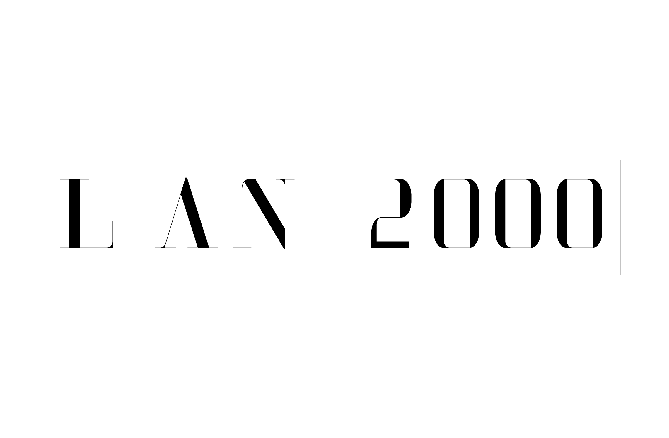
Nota, A Didot Font For Vogue
Almost two decades ago, Luca and I developed this classicist beauty mixed with some futuristic elements. It contains asymmetric serif remnants which are exact clone parts of a reduced set of curve segments used to create the entire alphabet. Unlike as it may seem on a first glance we didn’t use any of the existing Didot or Bodoni digital fonts but built it from the scratch. Its basis were original historical letters cut for in the eighteenth century. It had only capital letters and a set of futuristic numbers.
It is a task that has fallen into oblivion now for a while as today we have seemingly so many typefaces at the hand to create expressive editorial layouts. Quite often, though, those efforts suffer from something that himself probably would have called looking “cheap”.
I remember the fun it was to create many versions and ideas for a “futurizable” classicist font as this in itself is kind of a contradiction from both a stylistic and historical point of view. Thanks again, Luca, for the great possibilities you gave me to develop myself in the direction of experimental typeface design. Cheers!


