The Simmetria Fonts
As I no longer regularly follow for quite a time now I only got to know casually and with some delay what big changes have been going on there. the world famous and glamorous (at least this was also my first impression of her when I saw her illuminating figure for the first time in the floors of ) fashion editor has disappeared. At least, that is how it would be called in Italian language: synonym for death. And with her, or a few months later, also no longer is the art director of the magazine. I have no idea why nor didn’t I succeed in finding out anything about the reasons in the world wide web. Strange. Most probably they only wanted to give the magazine in troubled digital times a new fresh look or maybe a last chance to hold up against the market.
Sure, I am not the right person to discuss decisions like that. But I have always considered Luca Stoppini to be one of the last great magazine art directors in the tradition of *. In the sense of always searching for a striking point of view, the astonishing above the banal solutions. When we met in the years immediately before 2000 it was his idea of doing something with particular shaped characters (fonts) which brought me in.
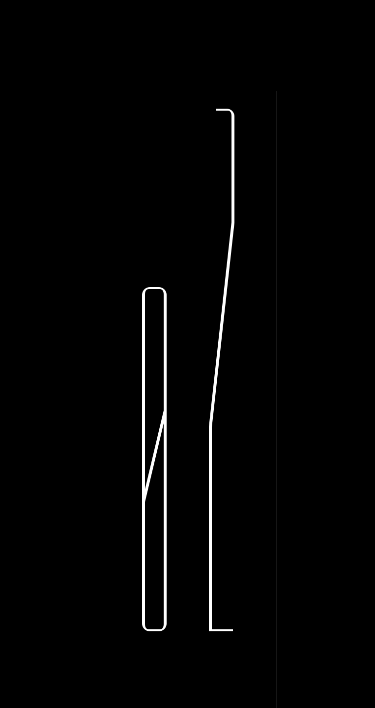
One of his favorites of this time seemed to be the experiments with very elongated letter forms. Things similar to what the Russian futurists had done in the first half of the past century. I loved it very much and without saying was very proud of being invited into his office in order to draw and create those fonts. One of the results was Simmetria which is shown here.
*Brodovitch has been, among other things, a quarter of a century the creative head of . And, indeed, he was famous for his mercilessness to not let pass anything under his direction that could even slightly be suspected of being trivial or without a particular point of view. As a side note it is interesting that he also experimented with typeface design from time to time, although in another direction.

