
Working on Reflection ‘8’
 Reflection ‘8’ · Comparing the Results
 Modifying Béziers
 Curve Part Review
When it comes to certain work processes, the evolving of a letter design, as an example, things are really getting complicated to describe, if not almost impossible. So many subtle influences slip into the mind of the designer. Glyph designs, while progressing, influence on each other, much of the drawing results appear necessary to be revised once you started with elaborating their spaces, and so on.
I always played with the idea in my mind to describe those kind of things one day, so that others could follow it in a way and maybe even get something out of it for their designs. But as hard as I tried to keep taking screenshots and write little essays about phases of my work, I never succeeded. It is just to complex and the things that you see and feel about a certain curve or segment to redraw for someone else are hardly reproducible. Find an excerpt of such an attempt and let me, at least, the tiny hope to not have wasted my time entirely. And what is most important: be inspired!
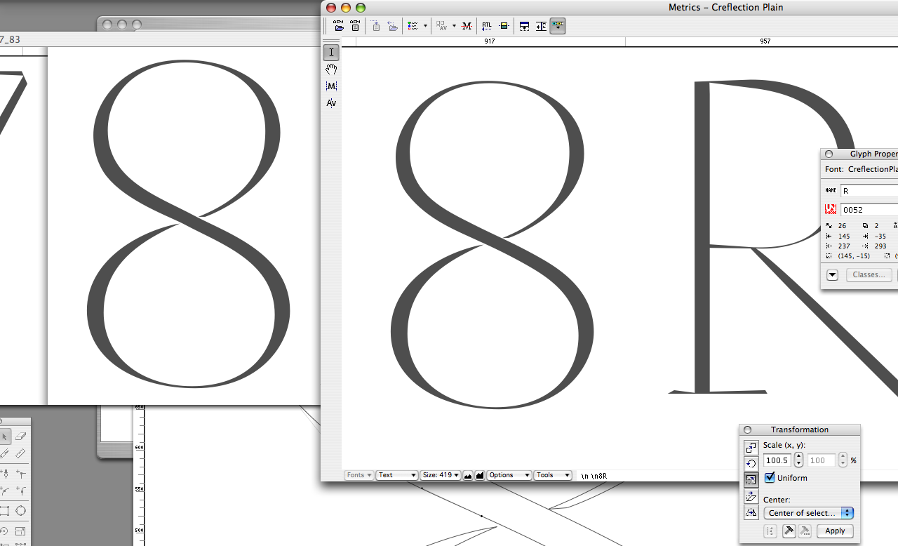
I decided to enlarge a little the inner center form of the upper bowl after I had inserted 4 new points to add a longer, almost straight line transitional area between the two bowls instead of connecting them by a single turning point in the middle. One reason was to adapt it better to the very fine and gracile ‘R’ of this character. By the way, I quite consciously left here the path of having exact same hairline thickness relation between numbers and capitals, at least for now. After all, for me its obvious that the strength of the excellent Renaissance fonts does not derive from their precise measures but from the outstanding capability that their creators had in making their forms match in feeling and subtleness, instead. (In addition, due to the generous ‘circles’ they seem to have embedded in their inner and outer lines). Speaking of those ‘nested circles’, the upper bowl on its inside was good enough for me right now, while the outer line on the left side (observing it with the letter image skipped upside down in metrics window) seemed to lack a little bit of blackness. […]
After all, for me its obvious that the strength of the excellent Renaissance fonts does not derive from their precise measures but from the outstanding capability that their creators had in making their forms match in feeling and subtleness, instead. Added this (fortunately I already had an extra point in this outer curve dividing it into segments as I often do instinctively in the left down leading part in bowls like i.g. in the ‘