
Why It Is Sometimes Sill(y) to Work in Metrics Window
 Metrics Window Background
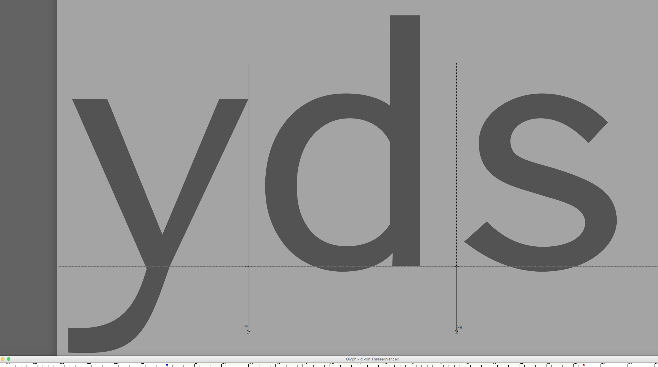
 Bézier Adjustment Via Keyboard Arrows · Hidden Glyph Window Foreground
I guess every (type) designer has his own methods allowing him to work more instinctively, those little tricks he uses to solve inconveniences that maybe only he himself sees in the regular process of work. What personally always struck me in particular while creating typefaces is the balancing act between what is supposed to be so tiny and on what we work while it is so big. To understand that maybe it is interesting to take a look back in the history of printing typefaces and how they have done it centuries before us.
The so called punchcutters whom of the last we remember a genius as (which my personal history, strongly connected to the work of , brought me near) used to engrave the final forms of an alphabet in the exact size that it was meant for. Of course, as it was a technical process that didn’t allow enlargement, zoom or reducing an intermediate shape to design*. It was “simply” (and these quotation marks should be typeset in 24 points, at least) chiseling the final letter form into a piece of steel from which the letter’s matrix was derived.
What he worked on was the final size, so he took perfect control over proportions as they are meant to be seen by the eye when reading.
What we do today, instead, is working on gigantic glyphs on an extra large monitor (or even 2 of them). Which is necessary to really have control of the Bézier curves, their points’ placements and tangent handlers’ adjustment. What we still need, though, is to have, at least, the same control over the final small letter image. So what I do in is combining to different windows while drawing. The expected Glyphs window, of course, showing me the Béziers construct and the Metrics window that is meant for defining the font’s letter spaces. And I do it in a quite strange way which sometimes slightly reminds me (I admit in terms rather philosophically) of the window sills that old Renaissance painters often put in their paintings to serve as kind of a leveling means to balance their composition by adding a horizontal bases to it at the bottom of the canvas.
I keep the Metrics open in the way that they fill the whole monitor and place different letter pairings on it which I think could be helpful to compare similar letter forms or simply serve me as an inspiration. The small window sill, however, that is on the bottom of my screen is the glyphs window of the character which I am focusing on. So, with on click of the mouse I can jump from one to another. I choose and activate points or curve zones in the glyph, drag its window to the bottom (make it almost disappear) and then use the arrows on keyboard to correct points position or curve rounding (by activating the curve middle part) inside the glyphs window in the pushed aside but still active foreground. While doing so I do not watch the construct itself but the image on the Metrics window (background). A more drastic way to compare the results is to copy the whole modified glyph’s Bézier construct via keyboard and then revert the font to the latest saved state. The former glyph can then be deleted (still only looking on the Metrics) and replaced by the newer result of the computer’s clipboard. Then, back and forth via keyboard and so on.
Probably this may seem quite funny for someone who uses a second monitor but it is the way of working I always preferred, I don’t know why. Maybe because it does not force my head to move from left to right. And, of course, it is not always an ideal means as I quite often tend to spoil the Béziers construct harmony too quickly by elongating too much curve tangents or neglecting the fact that while moving points also their handlers have to be shortened, elongated etc. (which I would probably not, watching the oversized construct in full resolution so to say) I just guess this is on the reasons that I never have chosen the path to really become a professional type designer. As I am just doing things quite in my own way, more for the feeling of it: less calculated, more by intuition. Or, to put it in an other way, to keep some of the mystery that for my very personal of view type designing always had and will probably still have in the future.
*We would have to exclude here pantographic methods as preferred by and others which, in fact, was a solution to draw the letter in a drastically enlarged stencil and reduce it then mechanically via the pantographic machine which engraved the matrices for the final alphabet’s size.