
Garamont: My First Letter Drawings
Last month you could read about my first love Garamond(t) and since then I wanted this little story to have another sequel. Well, here it is. From the basement of my parents I got some of my very first type design drawings ever: my pencil drawn reinterpretation of wonderful Garamont character* (which in truth go back to drawings of ).
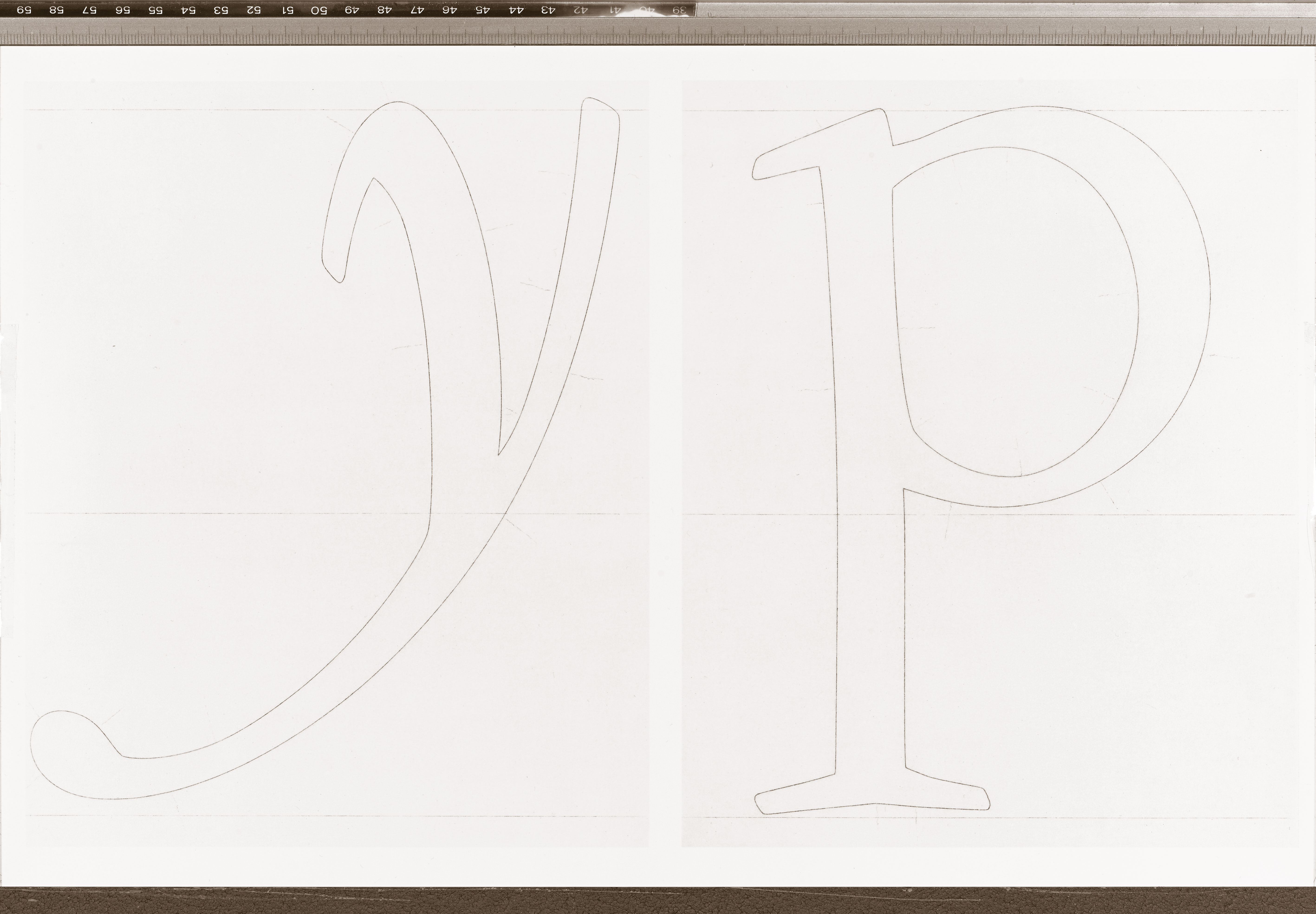
First of all I like to thank again who in this long past time was so kind to send me their beautiful hot metal printed type specimen from the 1960’s on which I began to work in the last of my university years. And yes, it took me quite a while just to finish the major part of the lowercase alphabet. Whenever I might have underrated the time a work should be supposed to take me, well, this was the record! From a friend of mine I borrowed an old photographic enlarger to zoom the letters from this printed specimen and my idea was to simply trace the so recovered lines with a pencil, fill them with black in a second step and mount them for the first specimen sheets. The two weeks I wished to take me for that task turned out to be a half year and I couldn’t imagine that even then not more than 2 dozens of letters would have been finished.
I underrated completely what those new lines would need to have to be called in reality outlines of a real typeface!
For I was a complete beginner I underrated completely what those new lines would need to have to be called in reality outlines of a real typeface! Fortunately, I had already some taste to judge my first attempts, so I was able to state that they were of no value, at all. So I rubbed out and redraw, rubbed out and redraw etc. Until after some 2 months or so I got nothing but my first idea of a serious letter. (I don’t remember which one.) I spoke to professors of my faculty but, to be honest, there weren’t much of a great help to discover the secrets of a true Roman printing type.
But the story came to a happy ending. Though, it was not even close to what I proposed myself to achieve (having a character to work with) it ignited my passion to design typefaces, forever.
Read also [German and Italian language]
Credits:
| Photography