
My Beloved Garamond
Going back in the past sometimes is fascinating, sometimes maybe pathetic, but for a type designer it is nearly vital in two senses. First, keeping the track of your own career, remember from where it all began, analyzing what influences of the origin – maybe the first character by which we were fascinated – still is to find in our creations and evolve them consequently. The other is that of looking back thankful for those typefaces done by others made for other means of printing and which we have gone out to interpret with our own (out)lines.
It is that thinking of how much time has passed since its forms were crafted into steel for the first time, some 500 years ago, which brings a smile on us typeface designers’ faces.
In my case I don’t have to think twice before spelling that name: Garamond*. Or even more appropriate for my story: Garamont (written with the ‘t’ in the end). As I didn’t learn french language in school I had to wait for my father concluding the long phone call he made with , Paris in the nineties to tell me that he spoke to someone called and obtained that they’ll send me a bunch of character probes and specimen of their famous character from hot metal press. My first typeface study drawn with pencil was the result about a year later. ( Read here )
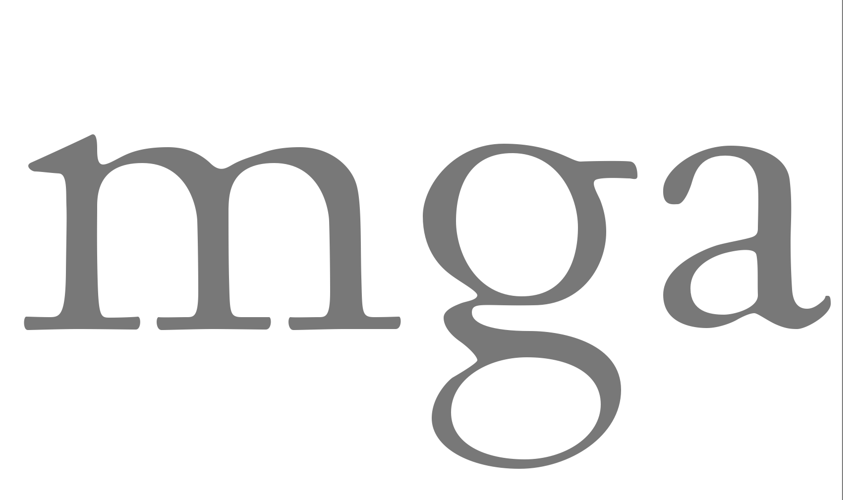
The one above, yet, is another of my later and first digital interpretations of Garamond in a version called No 3 by . I still like the minor ‘a’ which besides looks so different on all the Garamond versions1 over the history in printing and also digital typefaces. Small bowl and emphasized upper curve in some distance, however, is what they have in common up to the present day. Finally, it is that thinking of how much time has passed since its forms were crafted into steel for the first time, some 500 years ago, which brings a smile on us typeface designers’ faces.
*An Antiqua typeface (1540) or better a certain style of typefaces going back to the famous frenchman printer .
1 – Indeed, the list of Garamond fonts designed by different enterprises to fit different needs or just for adding their own individual branding touch to this classic masterpiece is long. For my eyes one of the finest is the version offered still today by American : very light and subtle in its strokes it adds just the degree of edginess to make it a very elegant font, specially for bigger sizes. had used it successfully to brand Italian fashion company . See more here.