An important part of this task was firstly to create a special Small Caps version for the FontBureau Garamond which should not be exactly a «typographic correct» small caps variant (which would have to have much wider small capitals and which would have to be fitted with more additional space) but a more fine and elegant solution.
A set of smaller capitals was created with only slightly opened bowl width. Mainly serifs were carefully adapted in weight and only little left and right space was added to the letters.

Trussardi Garamond: ‘Small Caps’ Size and Weight Adaption
Secondly we needed to care a lot about numbers which would play an important role in some of the more complex letter footers for Trussardi’s stationery (we had six general letterhead versions with several sub category designs only for the main houses’ branding!).
To give the character an overall less historic but more modern feeling I renounced the use of mediaval numbers (with alternating base lines). But quite soon the common alligned title numbers turned out to be to eye catching specially in the letter variants with a huge part of numbers in it (law, bank acocunts etc.).
So a new set of Garamond numbers was created with line height reduced and weight adapted to fit in perfectly with accompagnying mixed characters and capitals.

Numbers: Alignment and Weight Adaption
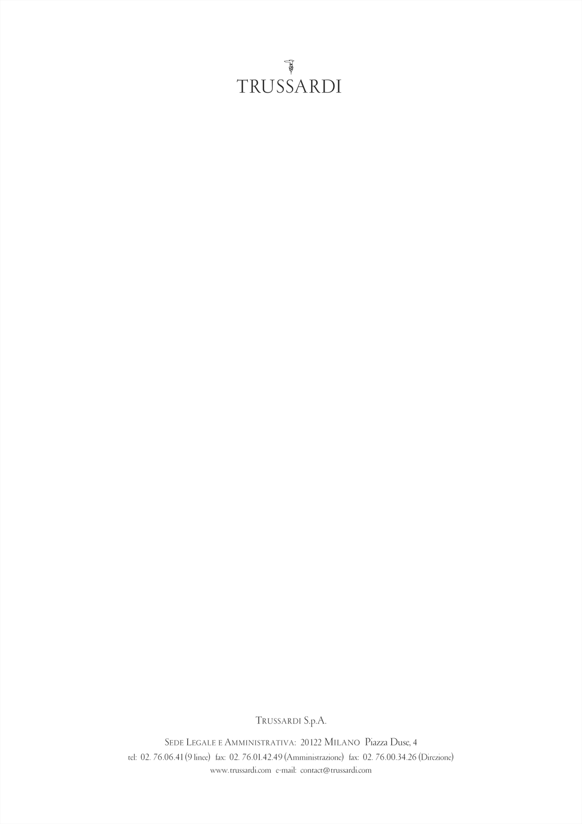
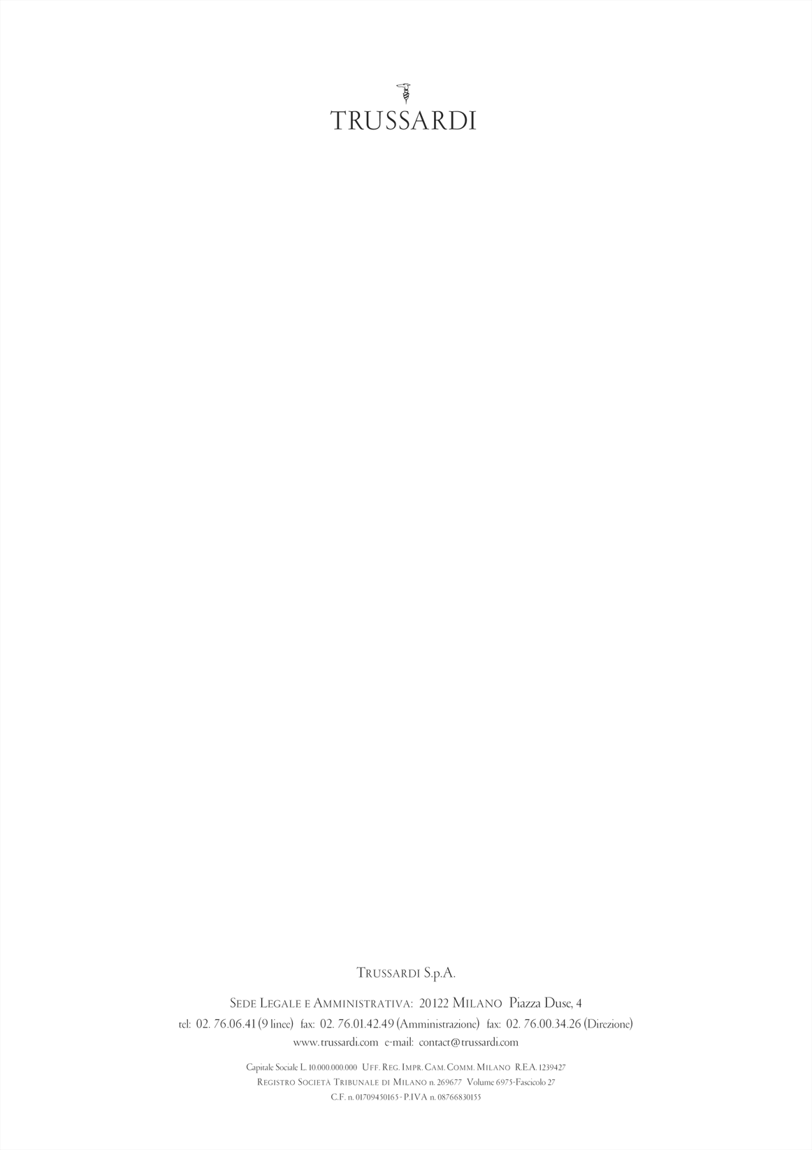
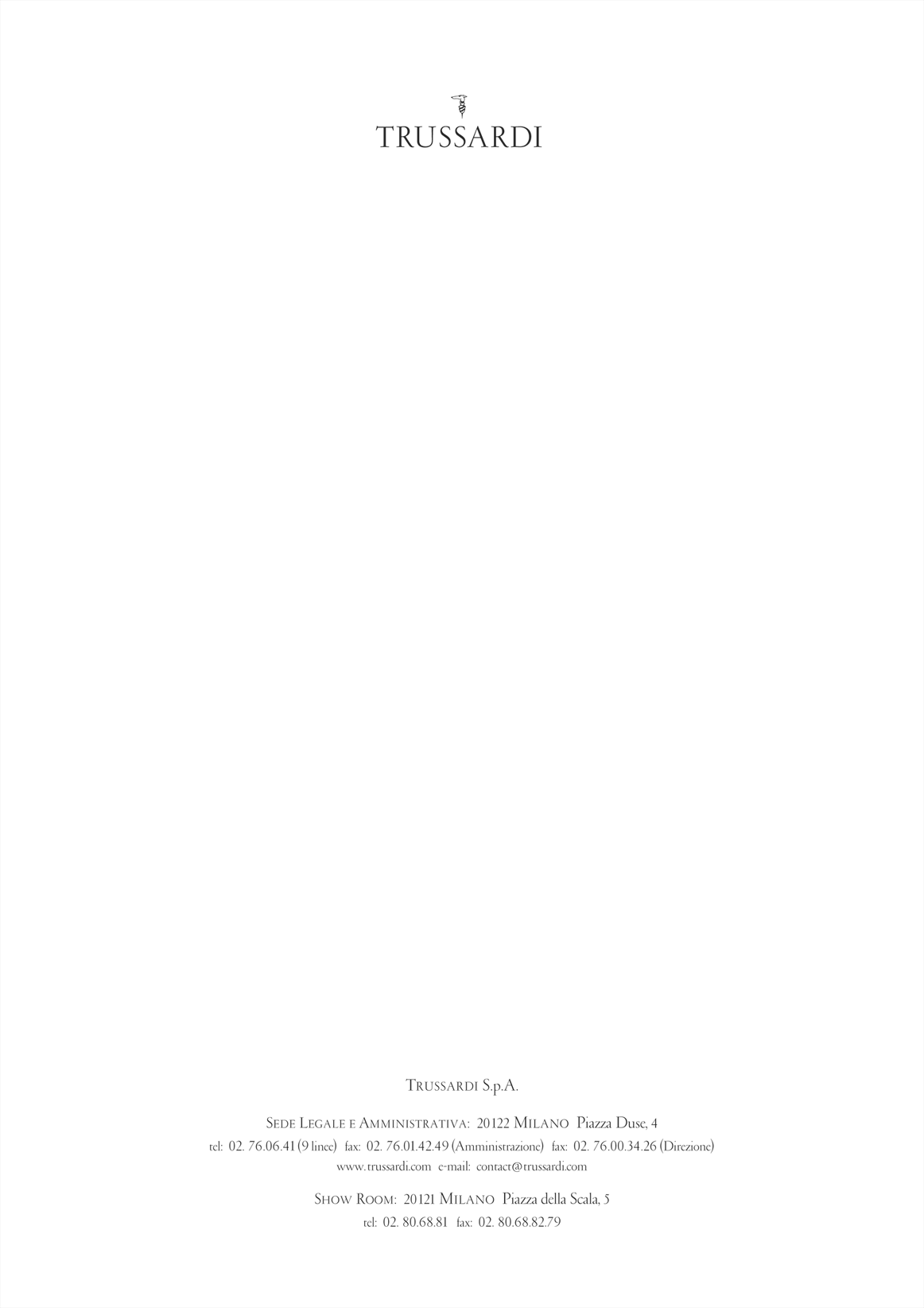
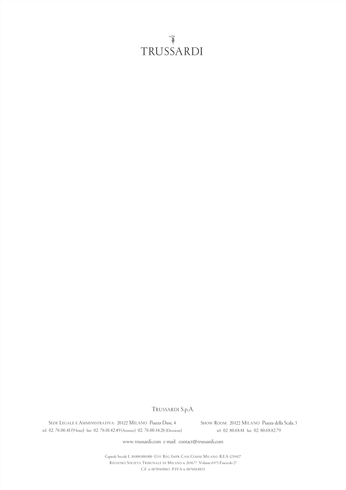
What did make the job so interesting and extensive was the particularly huge amount of documents we had to serve. For there were nearly a hundred of them including all the variations that had to be done for each of the three sections: Trussardi main house, the Fondazione Nicola Trussardi and at last for the incorporated restaurant nearby the famous Milan Scala building which is Marino Alla Scala. Below 4 of the basic 8 letter variants for Trussardi S.p.A.

Trussardi Letter · Version Standard

Trussardi Letter · Version Tribunal

Trussardi Letter · Version Showroom

Trussardi Letter · Version Complete

Trussardi Packaging · Adhesives
