
Working on Trussardi Small Caps
During my researches for a brand lettering I developed a special Small Caps version of Reflection typefaces. Here is the metrics window and beautiful as an inspiration fountain in the background.
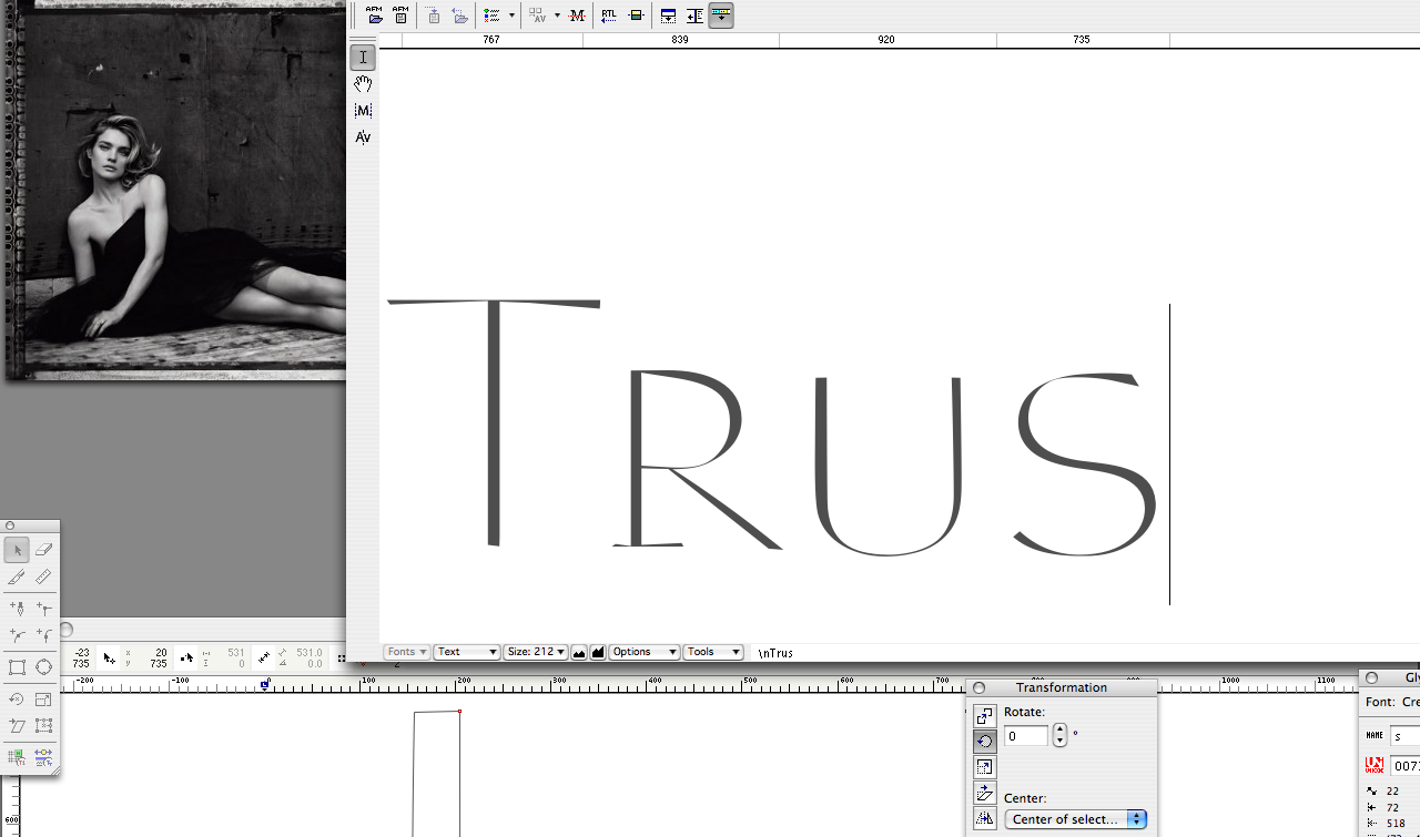
A particular task was to create a unique and special small cap ‘u’ which was hard to balance on the line without serifs. It introduces also a new intermediate stroke width between the thick stems’ weight and the ultra crossed hairlines. Which was necessary as, of course, without the serifs the ultra thin lines would not be able to create enough color on its right wing.
Another subtle detail you may note here are the differently angled stroke ends which are slanted slightly towards the outside. It takes up a typical characteristic of Reflection as you may also observe in stroke ends of capital ‘T’ and other letters, as well.
If you want to know more about my methods to develop small caps variants of typefaces read also [German language]
Credits:
| Photography