
Two Steps Forward and One Back
Sometimes during the design process it happens that we get aware that much of the work we might have done was in reality good for nothing. As when we rethink certain details of a letter again and again we might have lost something of that secret it once owned and which gave it its artistic quality. And it happens that we do not even know what this is. So, even it is hard, it is better to go back in time once in while and delete what we seemed to have achieved.
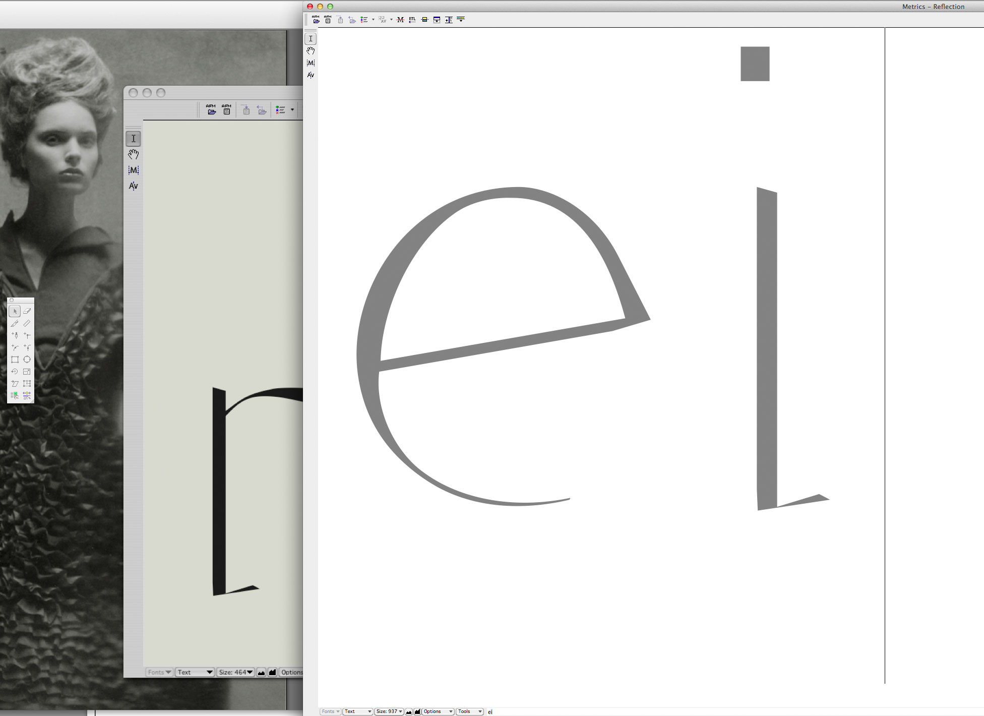
This is from the drawing process of the letter ‘e’ of Reflection. Its main characteristic was that the below bowl was ending in a hairline so thin that it practically didn’t has a weight. Sure this is something impossible to aim at in a reasonable font design. So I worked a lot to smooth out that error.
Then there came the point of return and I decided to skip all the process and switch back to one of its very early glyph versions.
Wie so oft war ich aber auf der Suche nach dieser gewissen Qualität, einer Art Unbestimmtheit, die die Formen aus ihrem reinen geometetrischen Konstrukt befreiten und ihnen ein „tessuto“, eine Fleischlichkeit, Stofflichkeit verliehen. Mein geliebtes Reflection-‘g’ besaß diese Eigenschaft, die innere Rundform des ‘e’ unterhalb des Balkens besaß sie dagegen nicht.
Read also [German language]
Credits:
| Photography