
Urbino for Trussardi
 Trussardi Drawing · ‘RSDI’
 Trussardi Drawing · ‘RSyl’
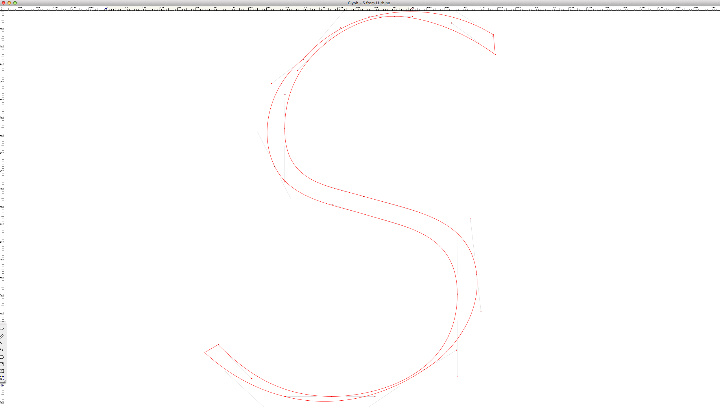 Trussardi Drawing · ‘S’ Slanted Outline
 Trussardi Drawing · ‘SDy’
 Trussardi Drawing · ‘ySAI’
 Trussardi Drawing · ‘yTS’
 Trussardi Drawing · ‘R’ in ‘S’
Some screenshots of a development of a Trussardi lettering suggestion. During my collaboration for stationery I did just for fun some experiments using Urbino typeface for a fine Renaissance orientated brand lettering that could renounce the application of the classic houses’ greyhound symbol.
You may note that Bézier curves on the outer lines are kept slanted avoiding to re-construct them in the usual maximal point way. This keeps the letters more dynamic and sober. Bowls were constructed by copying different letters’ parts into glyph window during the drawing.
A special focus was on the letter ‘S’ as it is doubled in the logo and attracts the attention first. (As by the way the doubled letters always play an important role in Italian language.) But also other letters as the ‘D’ have particular curve treatment to keep the sign more compact and add a specific italic character to it.
During the design of those obviously important letters I also insert many others that have a certain importance for the appearance and over all feeling of a typeface. Spaces are evaluated also in dependence on combinations that may not appear in a lettering, at all.
In a way my way of working is to do a lettering when I am doing a typeface, and doing a typeface when I make a lettering.