
The Trouble with the Own Name
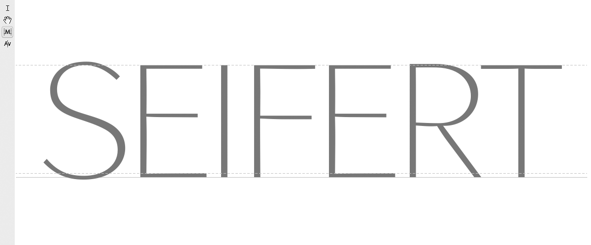 Seifert · Logotype Letters (part)
 ‘S’ · Logotype Letter Drawing
 ‘Sxia’ · Letter Comparison Glyph Window
 ‘R’ · Bézier Detail
 Revising the ‘S’ · Bézier Detail
One of the most difficult tasks for a type designer is the design of his own logotype. It is kind of a mystery why the proper name looks so ugly for oneself. I guess many designers all over the world have this impression and I sometimes wonder if Madame (who might not have been a type designer but undoubtedly a designer) whose name seem so wonderful pretty to us all and is so much admired might have had the same intuition about it, or didn’t she? Or let’s think about Monsieur himself struggling with the appearance of his house’s logotype for the same reason. It is difficult to imagine, yet, for me for both logotypes gain so much just because of the beauty of their letter combinations.
However here are some screenshots while working on my own logo reviewing its typeface.