
Interim Points
 ‘y42’ · ‘2’: Unsatisfying Turning Zone
 Vision ‘2’ · Temporarily Inserted Point
 Vision ‘2’ · Prolongated Turning Zone
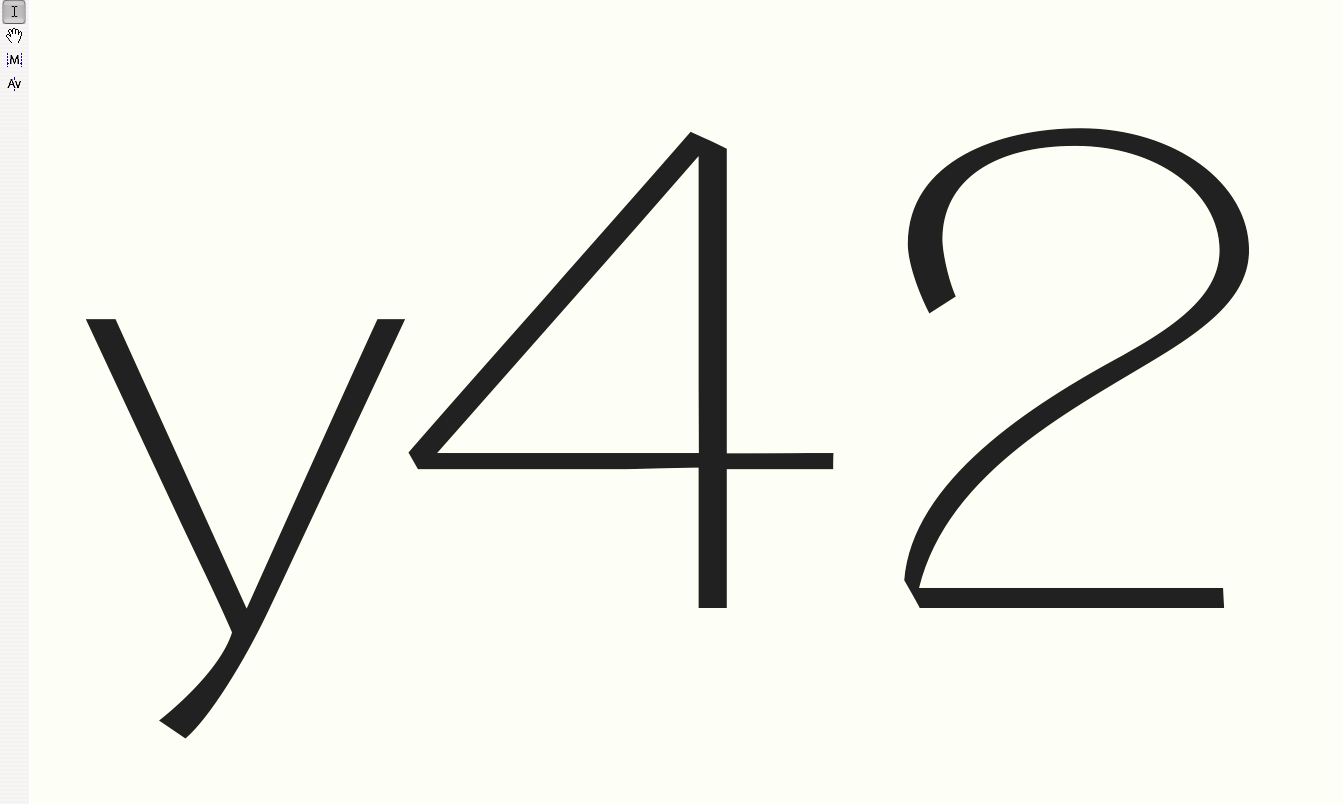 ‘y42’ · ‘2’ With Extra Point
 ‘y42’ · ‘2’ After Optimization
 Vision Numbers Interim Results
Here some intermediate results of my work on the Vision typeface numbers.
Vision has aligned numbers which have wide and rounded bowls. Sometimes it’s hard to manage those forms especially when it comes to turning points or conjunctions of curves with (almost) straight line elements. During the work process I often come to add extra points that build mini intermediate curve sections. They can help when curve turning areas feel to be to abrupt or the complete change of curve tangents would damage the whole letter design harmony.
Those tiny interim forms tend to vanish after a while or even sometimes are efficiently wiped out by the automatic optimization tools in font program leaving better results than before having them inserted. For myself I have special names for particular effects that quite often occur in design process such as shark nose which describes part of a bowl where the outer curve form seem to be to narrow so that it creates an unnatural rounding tip almost something like an “edge”. It can cost hours to better those zones without influencing on the entire letter’s curves’ balance.