
The Ugly Little ‘g’
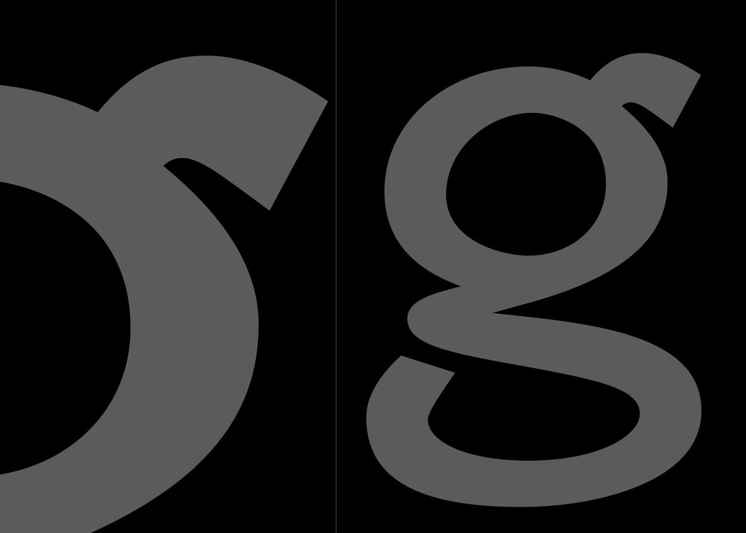
A quite curious little character in my Advanced Text webfont (working title Threeadvanced) is the ‘g’. It has those strange angles and at first glance weird looking curve segments, it is like the Italians would say a little «bruttino» and I admit I like it that way.
Despite the fact that I never had so much respect for a correctly layouted Bézier curve, its form grew naturally over the time and I tend to work on it when I am in creative abandon trying to put down all this too much rationalizm (which perhaps would have led to a rounder and smoother form). And I hope I am doing well so. After all, how could those letter curves – if we imagine this ‘g’ to be not bigger than some pixels height – be turned by an immaginative pen in a perfect round and smooth way? I guess this is what those naturally, instinctively growing forms are trying to tell me.