
Why is the ‘a’ so hard?
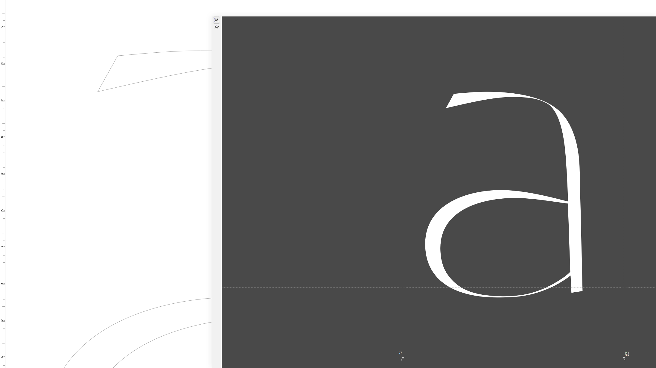 ‘a’ Work Process · Reflection Typeface
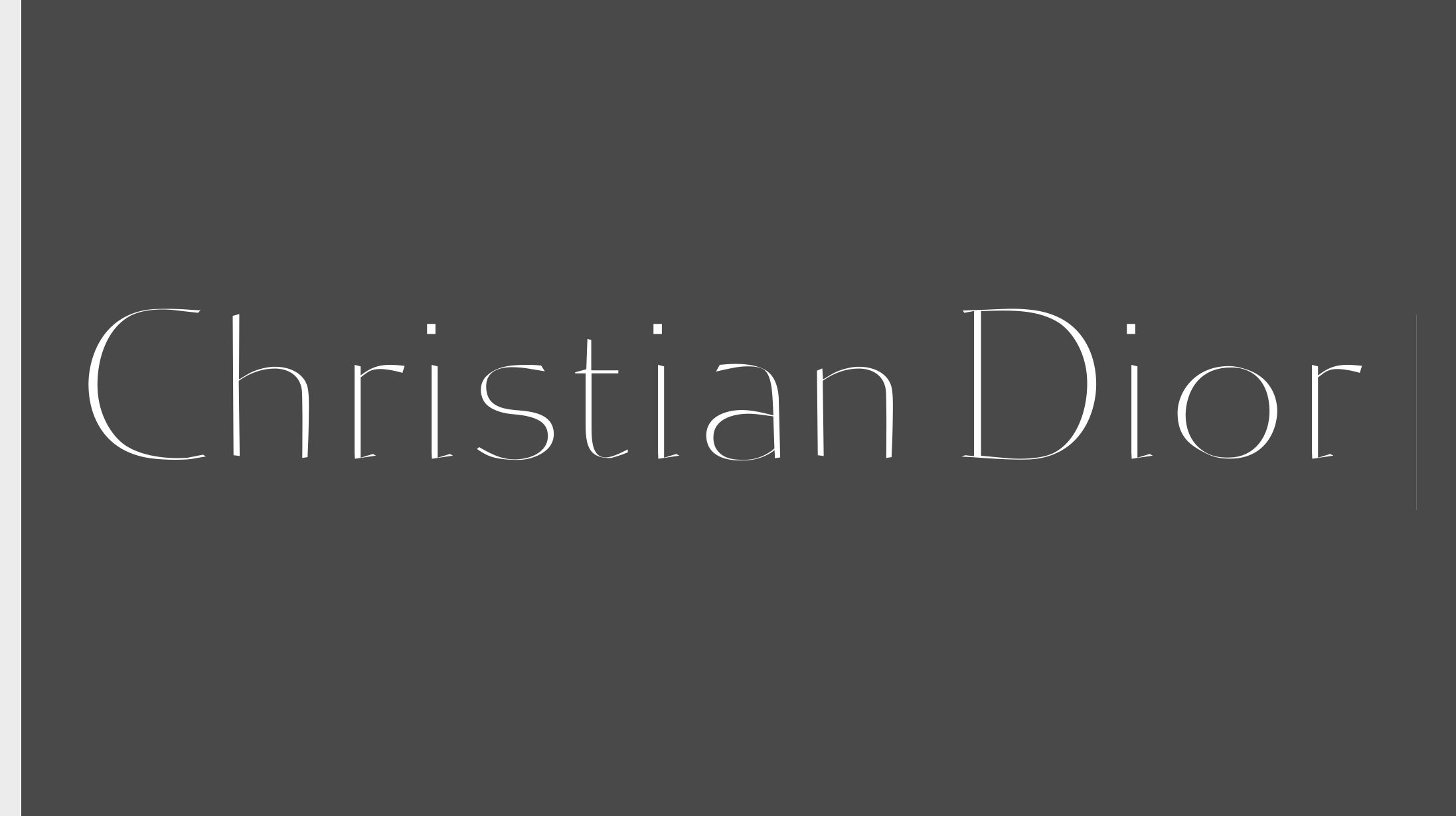 ‘Christian Dior’ Metrics · Reflection Typeface
… and at the same time such a pleasure to design, too?, I guess I’d have to add here. I am quite sure that all around the world (at least in the western part of it) font designers have a particular relation ship to one single and very special letter in the Roman alphabet: the lowercase ‘a’. Yes, and if they may have a particular one, mine would have to be described as maniacal. Only doing a quick estimation I would say that 50% percent of the time I spend for doing a character design goes into the glyph design of this tiny colleague. Guess this is also the reason why most of my fonts are and will never be finished completely.
Why is it so fascinating? I presume that it is related to the fact that in the lowercase ‘a’ like in no other character so many shape transitions, curves, bowls and straights (but not really) have to be combined on such a small area of space. We have the smallest “eye”, its counter part, inside the main narrow bowl and we have to deal with attaching it to a relatively short but important up going axis which for itself has to be transformed into a round upper part.
When we take a first look at someone else’s typeface or have to judge its quality or its historic meaningfulness we will concentrate very quickly on two of its lowercase letters: the ‘g’ and the ‘a’.
And let’s be honest: when we take a first look at someone else’s typeface or have to judge its quality or its historic meaningfulness we will concentrate very quickly on two of its lowercase letters: the ‘g’ and the ‘a’. But what regards me I always deeply watch, almost meditate over the latter one of the both. To go deep back in the past, this has been for me one of the main reasons, I admit, to always prefer ’s mother Roman font to the one has promoted (). His ‘a’ is so beautiful! So genious in its solutions that I would dare to say you could hardly find a better one in the history of printing evolution.
But I don’t want to do a historic lesson (besides, I guess I would get some very contrarious opinions). I just want to lead your attention to this genious little letter in general. What is needed to make it a success, how does it influence on the whole evolution of a singular character’s style?
First of all: if you might think that its horizontally orientated bowl has to be perfectly round, I would say: no it shouldn’t. Try to remember that the origin of (nearly) all of our typefaces lies in the handwritten letters forms like it has been done with a brush or a broad nip pen. And if you would have to turn around a line drawn by hand within such a small margin of space you definetley end up with some kind of angles in its different parts. (Ok, allow myself a very last turn back to the past and see how angular #Jenson’s one is). And this is good so! Here we have indeed a very important if not crucial moment to decide over the whole character’s character. It could be more angled, almost rectangular, it could be more round but then would have to be opened up, which will influence on the measurements of middle and ascending/desceding parts of your font and so on. And be always aware of how closed your “eye” is, in order to not envoke black staines in your text when closing the eye a little over it (and judge its distribution of blackness).
Secondly, and most important obviously in serif typefaces, is the end part at the bottom of the straight line on its right. How much will you focus on that, how strong or dominant it has to be to help your little ‘a’ to be better combined with the letters that will follow in a line behind? In the sans serif will there be a slight accentuation at the end, a little swing where the straight line ends? This might have an influence on some of the other forms of the alphabet. If it has, your sans serif character may tend slightly towards more classic ancestors as Akzidenz Grotesk or Franklin Gothic. Then the other round forms should have a more warm settling. Otherwise (ending up straight) tendence willl incline towards modern pseudo styled fonts. The ending of the ‘a’ stem is no more but no less a hint of which style you’d prefer. At least take it into account.
I personally prefer for the serifs a more accentuated final end stroke here (like it is beautiful to see in Jenson), more heavy instead of a meaningless upwards bent serif, and somewhat merely decorative “umbrella” handle.
Speaking about straight lines: the stem of the ‘a’ in reality is one the most difficult parts in the whole alphabet. It is indeed very short, should not be perfectly straight (in order to not smooth out all the liveliness of your character) and it takes some mastership to transition it into the heavy round upper half bowl. The momentum of the turning half circle coming down has to be taken up and followed in a way until the end of the movement of an immaginative writing tool. So the straight stem has to have something round in it, specially considering that also the attachment of the bottom bowl creates some subtle influences on its evolvement. Usually, escpecially in characters layouted for use in small type sizes, the inner part of the stem, meaning its right part of the inner bowl form, you would shift it a little towards the right in order to evitate the too high condensation of black parts in the letter. In other words take care to open the bowls counter a little beyond the logic of singluar straight stroke. Use this line part also to give an indication of its final movement to the right bottom. I personally prefer for the serifs a more accentuated final end stroke here (like it is beautiful to see in Jenson), more heavy instead of a meaningless upwards bent serif, and somewhat merely decorative “umbrella” handle.
Apropos attaching a bowl to a stem. The old guys (as would have probably said) used to not simply sharp edge stick the hairline onto the stem axis. They usually tried to melt the forms leaving tiny sort of “bridges” where those forms dive in into each other, sort of small triangular mini forms. This reduces the irritating sharp edges in the negative form (imagine to turn what is black into white and viceversa in a text picture) of a character. The ‘a’ will definitely force you a lot to think – or better feel – about those details, and solutions you might find here will help a lot for the rest of the folks.
The end of the upper half bowl is another field of hot debates. As detested, so do I (ok, I would exclude here, for it is a complete different world of style) to make a drop here. It is so very undynamic and frustrating! End it up with a clear cut or do some kind of final (pen) turn around in order to give this part of the letter stress and strength. So unusual, and as well as pretty, are some characters in history (as Garamond and others) where the down bowl intentionaly is much reduced in size to strengthen even more that “roof” part of lowercase ‘a’. Definitely elegant and original, as far as one can be in designing serious typefaces that will not irritate a reader!
So there are many interesting parts in this letter that for my eyes makes it a kind of “father” to the other lowercase letter components. Worth the effort, worth the time to care about and at last the passion that might find its way into your whole design creation. Good luck for it!