


- Typefaces: Classico, Jenson (hand drawn)
- Work: Typeface Design
- Date: 1994–2009
- Related Mag: Why Is The ‘a’ So Hard
Many many years way back in the past during my university time I already started out with first researches around the Renaissance mother type of all characters the famous character named after Nicolas Jenson, storical printer and punchcutter whose origins were those of a goldsmith.
I remember as if it was today when I was sitting in a café near my university and first opened my newly bought volume I of «Printing Types, Their History, Forms and Use» and saw the double page of one of Nicolas Jensons’ printed pages. To tell the truth an overwhelming impression that never left my inspirational background of any of my later typeface creations (to tell the whole truth together with another slightly awkward impression anytime I decided to come back a little to my researches of that time: that of dealing with an heritage here to big to handle in any way)
What struck me most was the eveness of such a page, the extraordinary harmony of letter widths and spaces that add up to create kind of a woven carpet out of singular letters. Since then I always preferred (and still do so) them to the later characters of Griffo which in the eyes of too many (for my opinion at least) is looked upon as a master for our modern text typefaces the so called Roman character (Germans prefer to call them Antiqua which is indeed slightly more specific for what concerns its origins). The characters of – which apparently later transformed into the ones of and others – were narrower in their drawing and therefor establish a much more more tight overall rhythm on page. However they lack the genius more circular based proportions of Jensons typeface and therefor incidentally do not create such a harmony in rhythm.
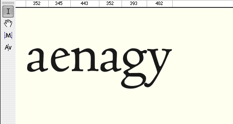
In the following pictures I try to sum up its basic principles and explain what became the basis of my own attempts to recreate part of its beauty in new typeface versions inspired by this unrivaled master in the history of printing type.
- Typefaces: Classico, Jenson (hand drawn)
- Work: Typeface Design
- Date: 1994–2009
- Related Mag: Why Is The ‘a’ So Hard