

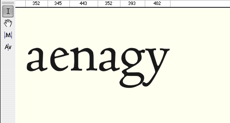
![Centaur VAL (Valdonega Aesthetic Line) 14–16pt Size · Hot Metal Page Facsimile [p.150, Candide ou l’optimisme, Officina Bodoni, 1944]](https://frammenti.stefanseifert.com/wp-content/uploads/2016/09/Centaur_VAL_hotmetal.jpg)


- Typefaces: Centaur VAL, Rogers Centaur
- Work: Typeface Design
- Date: 1995–1999
- Background: Flower Ornament
(as used by the ) - Related Mag: The Centaur Films
Since I had become an addict of beautiful Roman Type it came quite natural to me being also an ardent admirer of the, in my eyes, only valid re-cut of this typeface: the Centaur by the American type designer (his typeface came consciously to my eyes for the first time in a beautiful photo set1 printed calendar about Anselm Adams). In my first years as a student of historical typefaces I began with using digital version and adjusting its letter spaces to get closer to the rhythm that I felt more appropriate for it. For that purpose I scanned old hot metal type set pages in Centaur and used complicated methods to adapt kerning in the in those days available layout programs as QuarkXPress. My knowledge around typeface designing techniques at this time was very rare but it helped me getting kind of a first feeling for what later would have become a live long passion.
Some time later when I was engaged in the encouraging project of at Verona, Italy, the VAL (Valdonega Aesthetic Line) font library I had the great luck to come to meet this legendary typeface again. It became my favorite of the VAL fonts bringing me to even invent new special methods in digitalizing those hot metal printed characters and to give them back something of the appearance they once had.
Find in the following some images and brief explanations about my researches on the Centaur typeface.
1 – This refers to an older photocomposition technique where the letters actually were hand drawn oversized templates and then photomechanically reduced and set into words and phrases. Outlines of letters weren’t hat perfectly digitally “polished”, indeed they showed edgy details as if scratched on the outside when looked upon carefully in the enlargement.
- Typefaces: Centaur VAL, Rogers Centaur
- Work: Typeface Design
- Date: 1995–1999
- Background: Flower Ornament
(as used by the ) - Related Mag: The Centaur Films