
Last Refinements on Threeadvanced Webfont
A long long story finally seems to come to end. It all began with an ultra thin display typeface called Advanced. Which was influenced by one of my favorite Sans Serif typefaces Franklin Gothic. It had a less pronounced line contrast, sure was way thinner, but still kept some of its elegant color mood. Threeadvanced was developed as an accompanying text face for the web and itself has undergone major modifications and re-versioning over the years.
When you work on a typeface over a longer time period it is curious how it seems to adapt itself to the changing spirit of times. It is a thing inevitable to happen.
In a way it is the font I use to work on after a hard day of labour with a good glass of wine and my favorite music to relax and calm down. When you work on a typeface over a longer time period it is curious how it seems to adapt itself also to the changing spirit of times. Something what we Germans like to call ‘Zeitgeist’. In the beginning it still had some slight remains of typefaces like Meta or even Thesis form the late nineties. Then with the years, specially in the last 2 years, it evolved more and more in the direction of the nowadays popular lot more geometric forms as seen in Montserrat and others. It is a thing inevitable to happen.
Threeadvanced (“Version 3”) once had a large variety of fonts for different uses as, for example, to be rendered on screen with sub pixel technique or retina on the other hand. All those experiments were dropped in the end as web is in fast progress and keeping it up with a typeface in continuous refinement process is almost impossible. So I decided to go for one of the blacker versions of this large family in order to use it in a more general way. My logotype also is just a simple use of this typeface, no lettering or extra space adjustments.
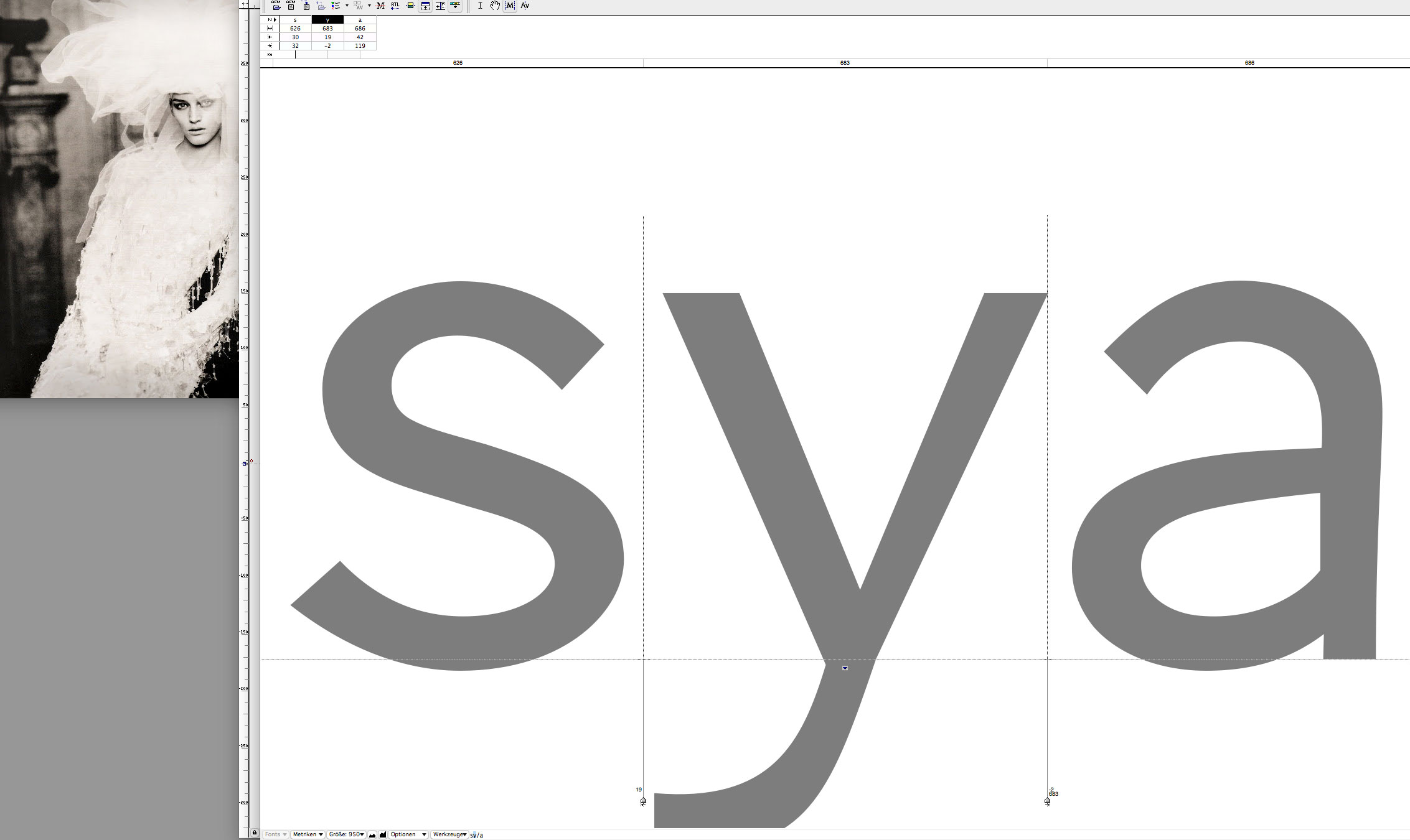
The picture above shows the process of spacing and some ultimate refinements on letters as the ‘a’ which has become slightly more stiff with more geometrical circular inner forms. Photography in the background is by . I particularly love to keep some of his sepia colored fashion shoots in the background to inspire myself and to unconsciously stick to some of this typeface’s original “color”.
Credits:
| Photography