
What is it that makes letters elegant?
I always tried to achieve a certain elegance in my typeface creations. Which is an elegance to be confronted with youth, the female body, but at the same time a certain classicism. And yes, letters and alphabets suitable for luxury products. Things that are resembled in this photography.
What do we see here? Sunlight. Wine. A beautiful young woman. The clearly visible structure of her legs’ bones. Difficult, ambiguous areas as in the zones around her knees. Where we see parts of bones that seem to fight for prominence. Subtle parts of her skin where the sunlight flows between her skin’s hair. But, as well, a certain hint at luxury, #allure, warmth and elegant Renaissance architecture in her background.
We may think of ’s logotype. The simplicity of those lines. Instinctively we search for products on this table to be marked with its appearance. We might as well imagine the scent of this young lady.
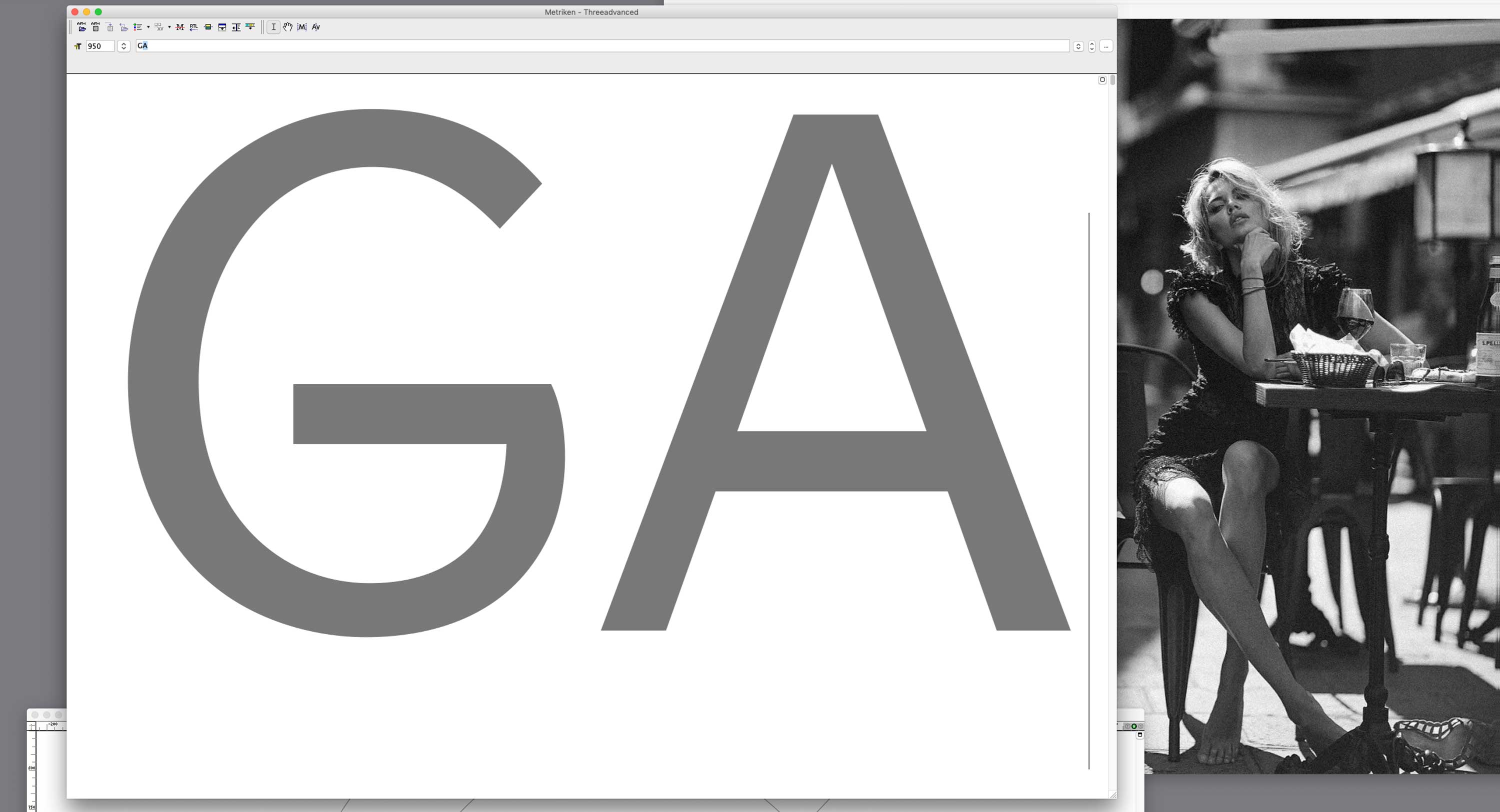
‘G’ and ‘A’ from Advanced typeface in the process of growth. What I like about this character, as an example, are the well pronounced horizontal lines. Which is a one of the tricks to add elegance to a sans serif font. And, even though it is much easier to balance a letter’s structure with elements that add stability (as it is the vertical foot line in Helvetica’s ‘G’, for an example), I tried to renounce them.
Upper parts of this ‘G’ are still way before being perfect. It might take further months or years to elaborate this character’s lines. Just as long as I am inspired by images of beauty combined with personal dreams, personal artistic views on a world which is (we know that by reason) non existent. But, which we still admire and reach out to express.