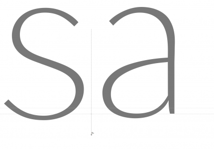
‘s’ “Allure” · Study (Process)
E così non mi dovrebbe tanto meravigliare che dopo averle per un così lungo periodo paragonate, osservate e affiancate al tanto agognato oggetto dell’ispirazione, anche le lettere stesse adottassero un qualcosa del suo essere. Una ‘s’ può avere una «Allure», come dicono i francesi? Guardando la curva nella parte superiore di questa lettera mi sembra senz’altro di sì.
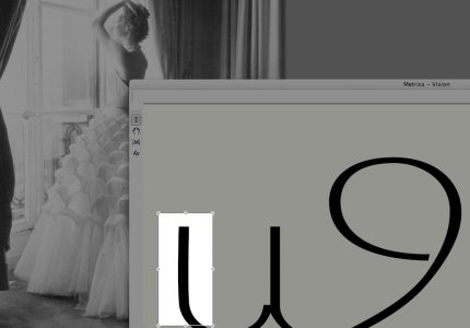
Chanel · Signer Lettering
Very often I make use of the technique to design letters in an upright position as well as with the glyph image turned upside down. It is easier to understand then where a letter lacks of harmony and fluidness. Here is an example with two ‘g’s of Signer typeface.
Even if this technique helps to get better results while drawing one has to stay alert not to make too extensive use of it in order to not distort letters’ rhythm, as our eyes are used to a certain direction of seeing things and we should not work too much against it.
In this particular situation while drawing Signer I was very much engaged in finding smooth roundness in letters’ bowls without, yet, loosing its dynamic line treatment, as well as keeping something of its broad nib pen nature.
For the rest it is sometimes better to not over-elaborate curves; some of our letters from the beginning on contain something of that very essential matter that is almost impossible to regain once left the path of spontaneity and intuitiveness.
Alcune mancheranno dell’estrema cura a cui altre sono state sottoposte, combattendoci sopra; perché ci sembravano già abbastanza belle fin dall’inizio, e nel lungo andare del processo e il loro stare ferme, davamo a loro una forza unica e particolare: meno preciso nei dettagli, ma più convincente nella sintesi del loro insieme. E forse ne conservano ancora, come una delle fanciulle in fiore di cui Proust parla, una freschezza originaria, predestinata a sparire, ma ancora protetta dalla paura, anzi dalla certezza, che la fatica non le cambierebbe nel meglio.
Typical for the Signer character are the non medieval numbers as well as capitals in almost Art Deco style with the ‘A‘ bar very low as an example.

‘2A’ · Signer Number and Capital