
Is it symmetrical?
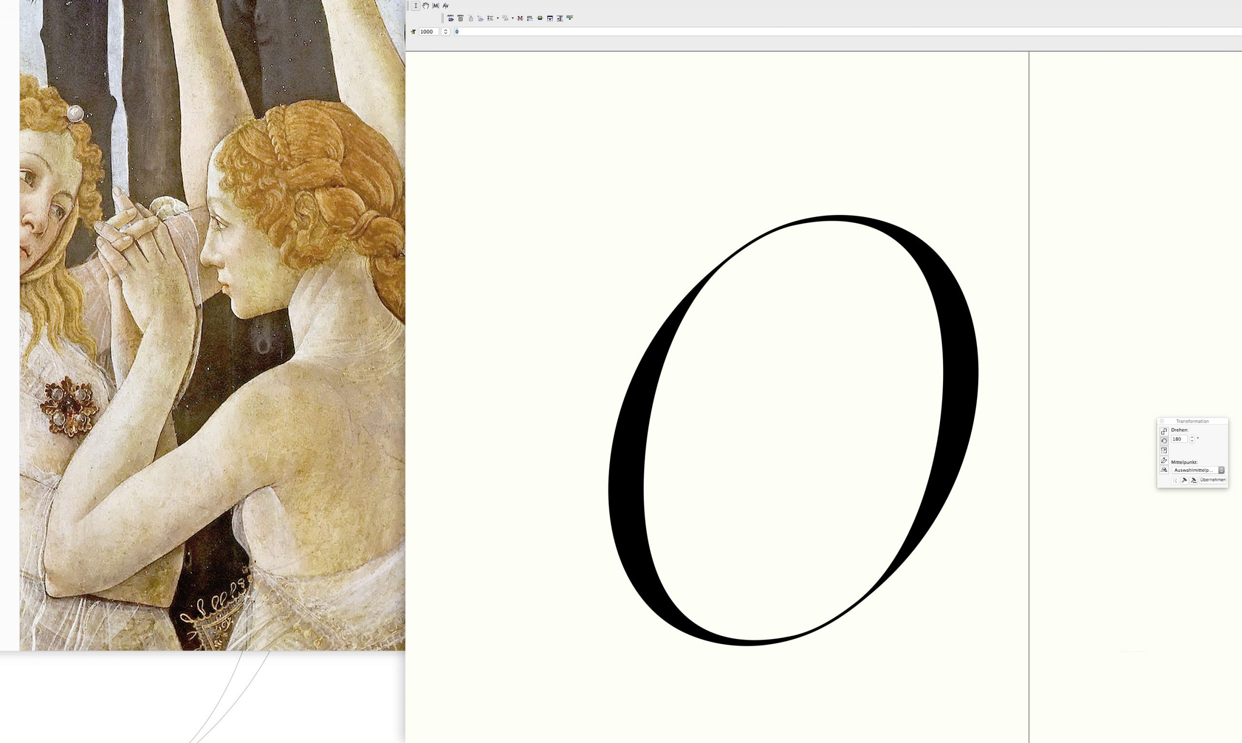

In the design of a typeface typically there are letters more interesting to do than others. The ones we use to determine a typeface’s style, look or feel and the ones which we might want to neglect for some time. Inevitably yet, sooner or later we have to spend some time drawing also the less interesting ones. And at this point someone may ask, as well: are they really so uninteresting? One of these candidates surely is the minor letter ‘o’. While creating a Sans Serif typeface we may be tempted to construct a circle. At least, even in the serif fonts where stroke widths swell in horizontal we hope that by drawing a quarter part and duplicating it four times we might get the job done. But human eye follow its own rules! Doing so the result is a letter seemingly out of balance, some kind of weird element among others. This depends in part on the direction of reading, as well as on other habits of watching in general.
What makes it so hard creating a well done ‘o’ is exactly that subtlety: making it seem symmetrical while taking care of these optical balance effects.
Even in typefaces which have a non inclined character, on the contrary to the antique Roman characters as Jenson and others, we might find that the inner circle, for example, needs to be inclined nonetheless a little bit. So that the eye while reading is not stopped in the flow of a line. In addition, the bottom curves of the apparently symmetrical ‘o’ behave differently to the upper ones. So, what makes it so hard creating a well done ‘o’ is exactly that subtlety: making it seem symmetrical while taking care of these optical balance effects. And let me assure you: it is a hard one!
In part we are relieved of this task in the italic typefaces where by nature we have only a flipped vertical symmetry. And in general the eye is inclined to pardon small divergences more easily. In this typeface called Reflection Italic (later Urbino) I implemented more concise pen characteristics such as tiny edges on its outer curves. This not only helped to make it a more harmonious partner to its quite edgy Roman pendant but makes it more liberal in the choice of how to handle symmetries. In order to get inspired for what regards its reading flow I used paintings for he is a true master of movement and lines’ dynamic.
Read also [German and Italian language]
Painting:
| Primavera (detail)