
Progress on Threeadvanced Numbers
Recently my graphic design work keeps me occupied a lot. But still I find some time in the remaining hours to work on Threeadvanced, the webfont I am using for my personal website . It is inspired by typefaces as Franklin Gothic and some of the more recent Sans Serif characters. So it consists of slightly accentuated stems’ contrast between thick and thin lines and roundings that open up a little at the endings as if created by a pen stroke.
I love the idea of having all kind of hidden circles that are at the basis of the bowls’ design.
Particularly interesting is the numbers’ design. Middle height is slightly increased compared to lowercase letters and they are oldstyle which means they have alternating ascenders and descenders. I love the idea of having all kind of hidden circles that are at the basis of the bowls’ design. Which is kind of a Renaissance classic alike spirit. I also prefer to see it as something a bit old fashioned combining it with pictures that have this gloomy and dreamy atmosphere while being sexy and feminine as well.
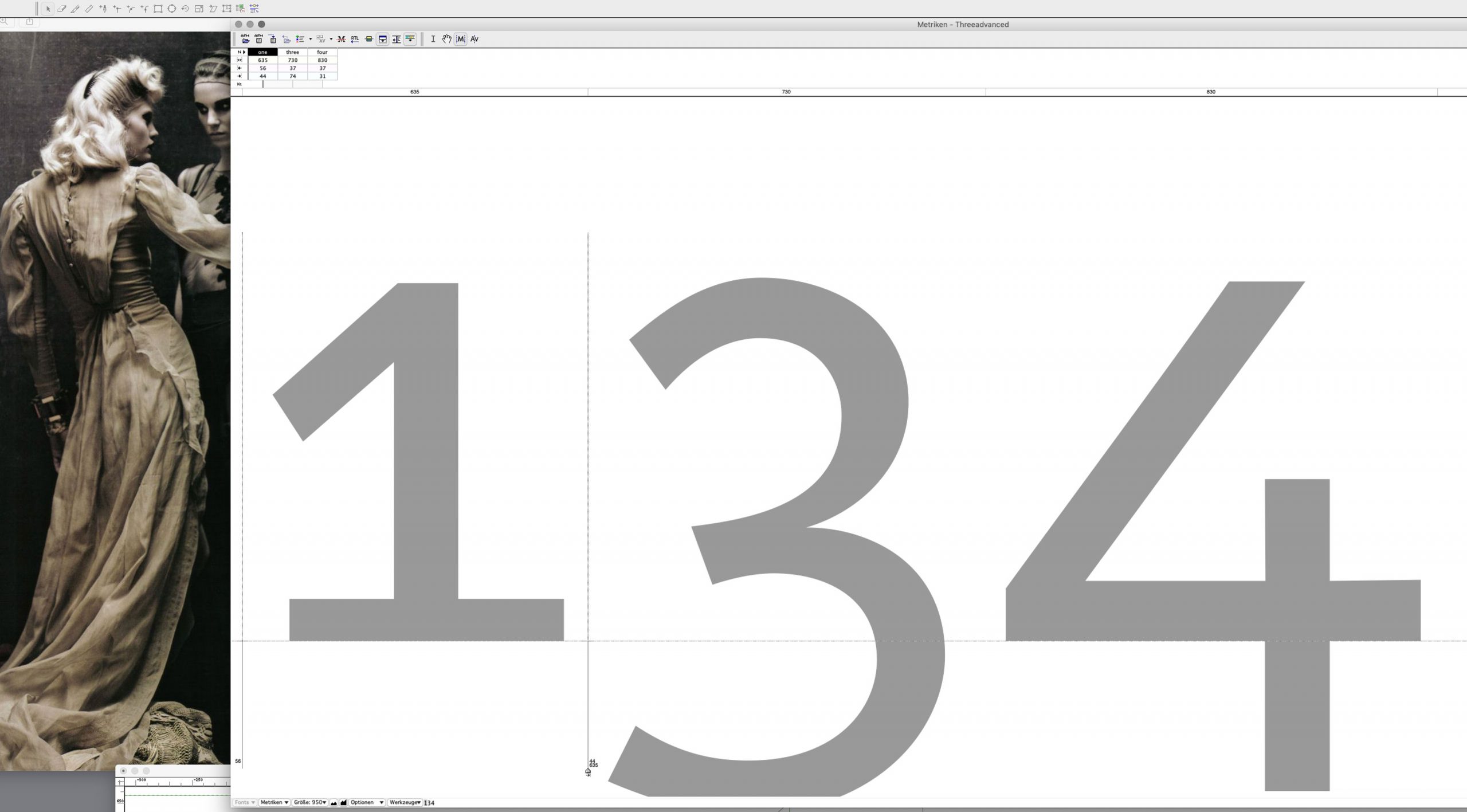
Here we see the boldest set of numbers in work progress which pairs the refinement of Bézier curves to the letters’ spacing.
Credits:
| Photography