
Typefaces and Photography
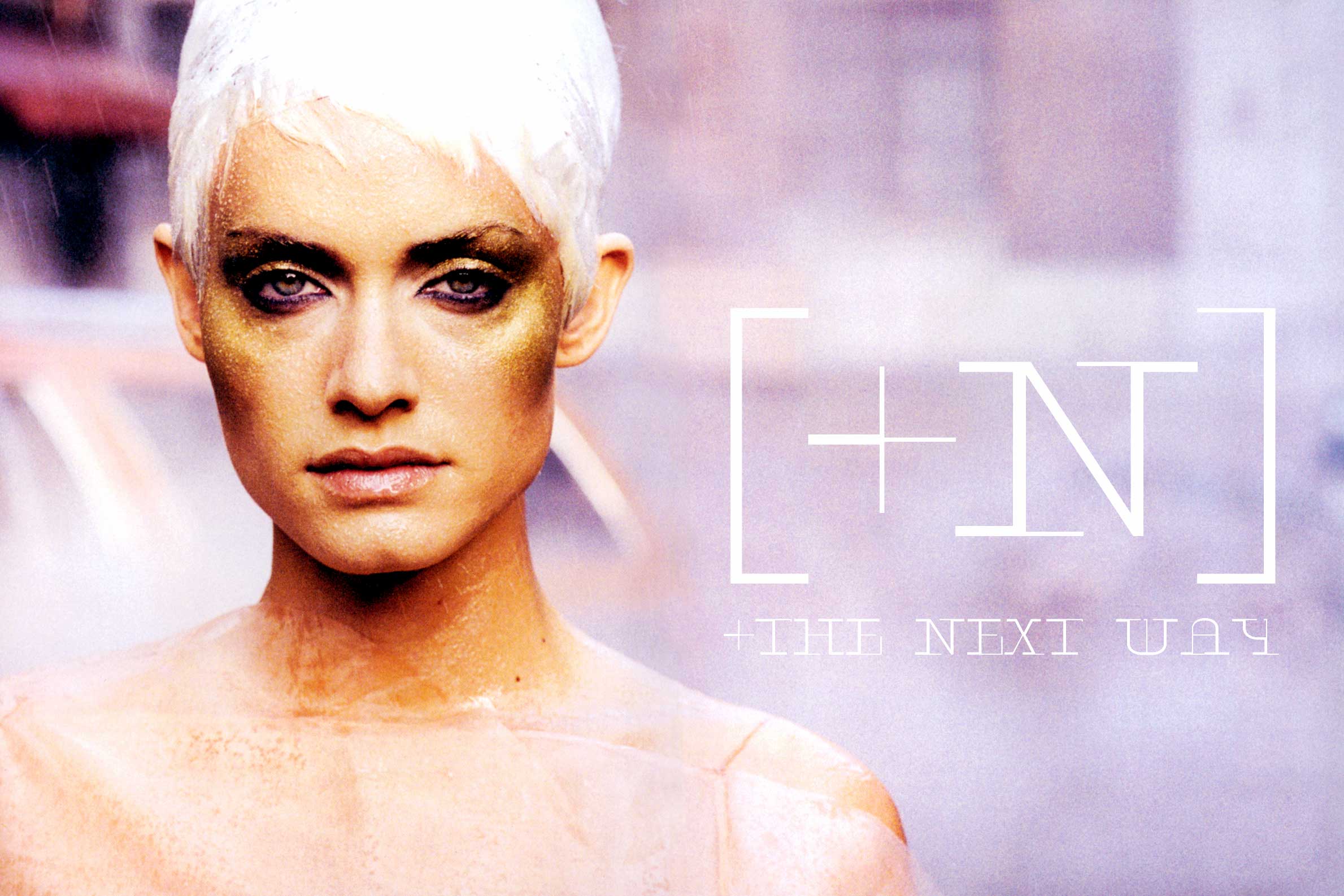
This comes a little late. But I guess it is never too late to say thank you to one of the greatest fashion photographers in history who has passed away this year. What you see here is a typeface called Next which was part of my researches for in the very late nineties just before the switch of the millenium. And it clearly breathes the spirit of those times.
As a photographer friend of mine uses to say it is not only that a type designer maybe inspired by photography: it is also photography who can take advantage of typographic work opposed to, or better mixed with it. I am sure in this case I couldn’t hardly add something to the brilliance of . Nevertheless, I am proud that my creations of that period were liked by Italian art director and later on have been admired by some influencer magazine art director in Germany, as well.
The character itself, apart from clearly aiming at futuristic tendencies of that particular time period, was supposed to also keep some of the fashion like classicist taste which we know to find in Bodoni and Didot. The experimental way of interpreting this fact, though, is that hairlines of Next were introduced in other places, for example in parts of their asymmetric serifs.
Certainly, a typeface like this today has less if any importance, but it is just nice to remember some of the inspiration that drove both of us. The type designer and the photographer himself. Thank you for this wonderful inspiration and, in general, for your awesome oeuvre of decades, Mr. Lindbergh!
Read also [German and Italian language]
Credits:
| Photography
| Editor