
Ultrafine Ravish Numbers Revisited
 · ‘21’ Ravish Ultrafine Numbers
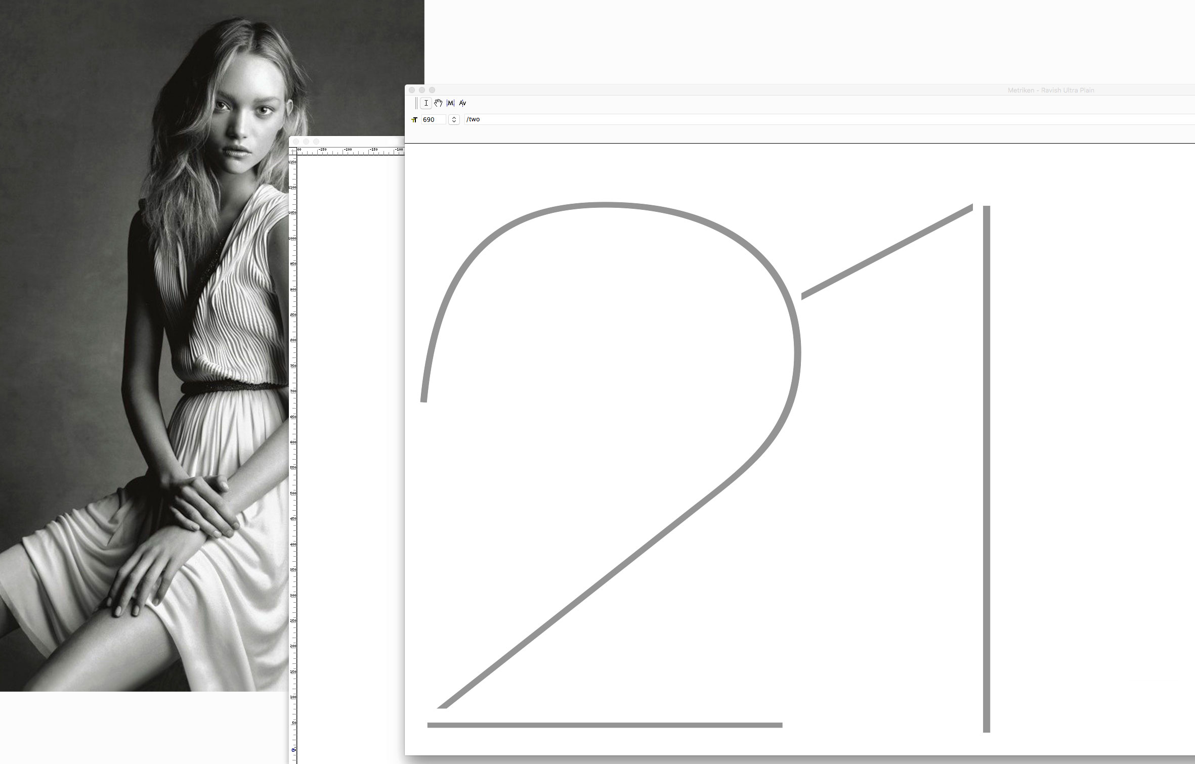
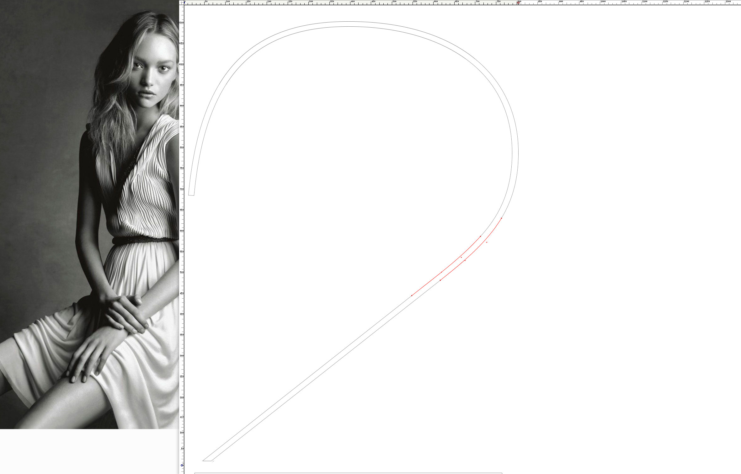 Ravish Ultrafine ‘2’ · Bézier Curves Detail
Sometimes it needs a little input to turn back to work on a character we did in the past. I owe this one to a very special person. These ultrafine numbers belong to a typeface which is called Ravish. I did a series of different weights varying also between rhythm and letter widths. It has a slight remembrance of characters such as Helvetica, yet is meant to add some special elegant detail. Most of its letters have unclosed lines.
Beautiful photographed by french photographer inspired me during the work process. Special difficulties arise on such very fine letters where it comes to form conjunctions as here in the ‘2’. Detailed Bézier curves were introduced to keep the transition between its upper bowl and the diagonal downstroke smoother.
Credits:
| Photography