
Counter Forms and Inspiration
In some occasions it can be useful to check your letter forms partially. It can be helpful to delete the outer line of a letter temporarily and observe its so called counter for a while maybe in comparison to others.
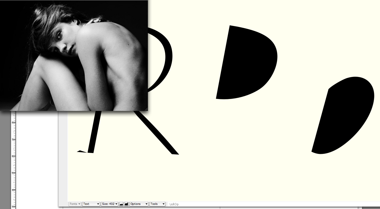
Although I personally tend to not overestimate this aspect of a letter design it is generally not less important then the outer part of a letter form like a painting or photography that is, at least in part, defined by its dark shadow parts. As I am fan of curves that are not “too” round and show some kind of edginess I am checking here if this is also true for my counter parts. Look at the counter of the Urbino ‘R’ in this case (in the middle) and note the slight flat part of the curve beyond the maximum point on its right. It should be where the outer line “waits” a little while turning and moving backwards on the inside of the letter. I liked this part whereas the other form of an upside down turned ‘a’ (the one to its right) is less good in my eyes.
For inspiration purposes I kept an eye on beautifully photographed Natalia by . You may look at form parts like her lower #leg to learn about natural rounding and how the muscles tend to flatten their form a little. This is what I am searching for in my characters’ design as well.
Credits:
| Photography