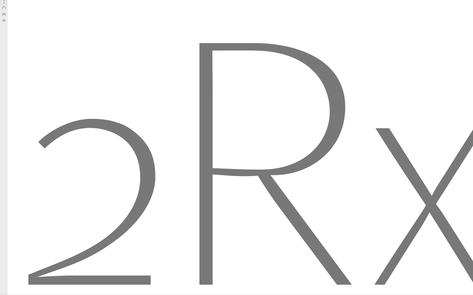
“Rub Down” the Counters
Sometimes when I get the feeling after a good while of these painstaking minor changes that a curve has a “new born” more precise dynamics but that this “melting down to the form” process has made its weight to low then – in the way that an old punchcutter would do it with his punch – I rub down my form by decreasing its counter form size by very small steps like 99.8% (keep an eye here, too small steps may cause the decrease not to be uniform any longer). Then intuitively going back and forth in the history until I decide when to stop.
The somehow analogue technique for the punchcutter was to rub down his punch so that the conical steel rod and with it the countered letter form on top of it got larger in its surface and therefor thicker in its thin strokes. In this way the goal was achieved to leave the design untouched yet make its general appearance a little thicker and stronger in weight.
Obviously one may also use the opposite way and widen the outer line of a letter form or combine both of them. Another method would be to use (if you are i.g. in ) the effects options and influence on general letter shape thickness. Important is to be careful and test with minor changes. Afterwards manual corrections are obligatory.


