Different Character Sizes
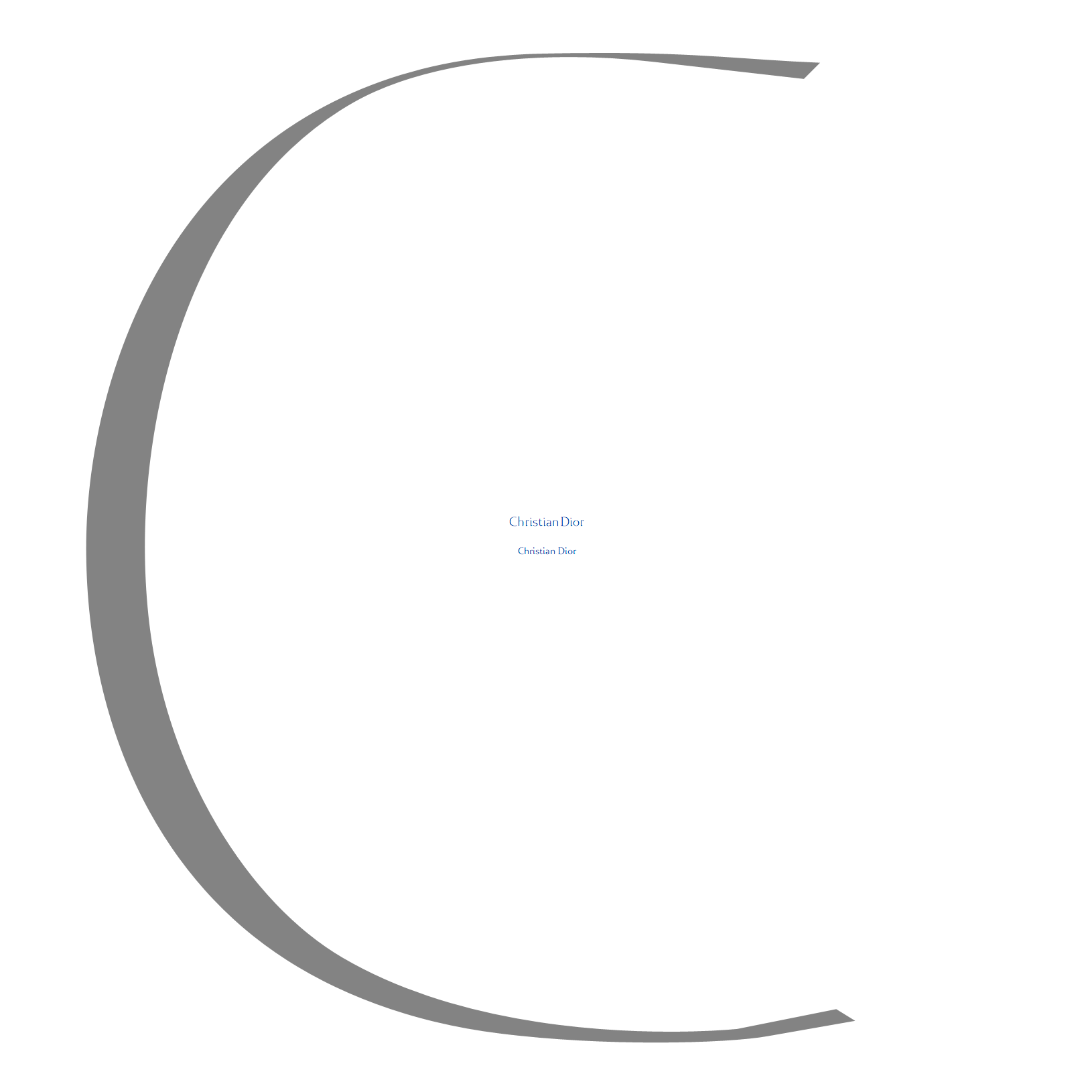
Every typeface designer is aware of how the use of his creations over different font sizes effects his original design idea. Some typefaces (like most of mine) are even intended to be used only in bigger display sizes others do their job best when used in masses and with smaller point measurements. Way back in the past when I collaborated for the Valdonega Aesthetic Line (VAL) intensive part of our work was to redesign every book typeface of the collection in 4 or more different guide sizes. This experience since then I kept deeply in my mind and I think it is one of the basic experiences every type designer should make sooner or later.
See here some impressions of my first attempts to adapt very much oversized Reflection Caps into something that could in certain rare occasions also used in extremely tiny words on monitor. It happens to be not developed further so it will certainly not stand up severe critiques, yet, I’d love to share some screenshots just to get an idea of what I am talking here. Enjoy.
For German readers I will attach also a text part from some thoughts of mine that I gathered during its making. You may discover this related essay [partly German language] here


