
A Mirror
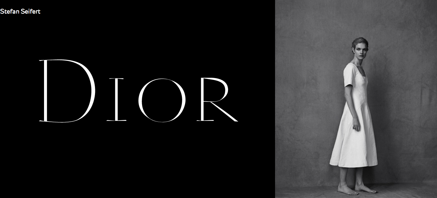
When I was recently working on my personal website relaunch (www.stefanseifert.com) I stumbled casually upon a photo series by for griffe. It shows beautiful Natalia Vodianova in sensual black and white pictures. Something urged me to put them beside my own Christian Dior typeface researches (purely artistic, no commercial benefits for me).
And there it was again: the knowledge why, at all, I am designing typefaces. Letters are made for beautiful sensible woman. Their lines reflect those of their bodies. And not only.
It is something magic that connects them both in my eyes. Maybe it’s about sensitiveness or the way the inner nature of forms matches in them. At least, this would explain why in the history of arts they so often served as muses to us.
Read also [German and Italian language]
Credits:
| Photography
| Model