
Revision of Advanced ‘s’


 New result ‘s’
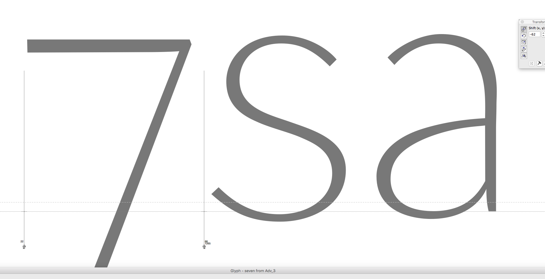
Screenshots during the work process on lower case ‘s’ for the Advanced character. Parting form an original form that seemed to me having a good dynamic flow, yet, tended to separate the ‘s’ into two different form zones. The upper one more circular with less dynamic pen stroke then the lower one.
I decided to elaborate the lower one instead and make it more symmetric to its upper counter part. Slightly less dynamic but more fashionable elegant. This led over several versions that have broken digital curve harmony and made it necessary to re-adjust many curve segments in order to re-establish correct curve connections and flow.
During the whole process the letter is scrupulously observed in flipped position to clearer show vertical symmetry disharmonies. Different letters were inserted to take control over rhythm aspects as bowl widths and letter spacing.