
Advanced Work Process “Impressions”
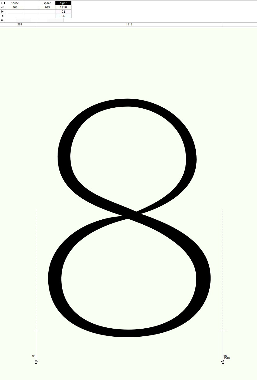

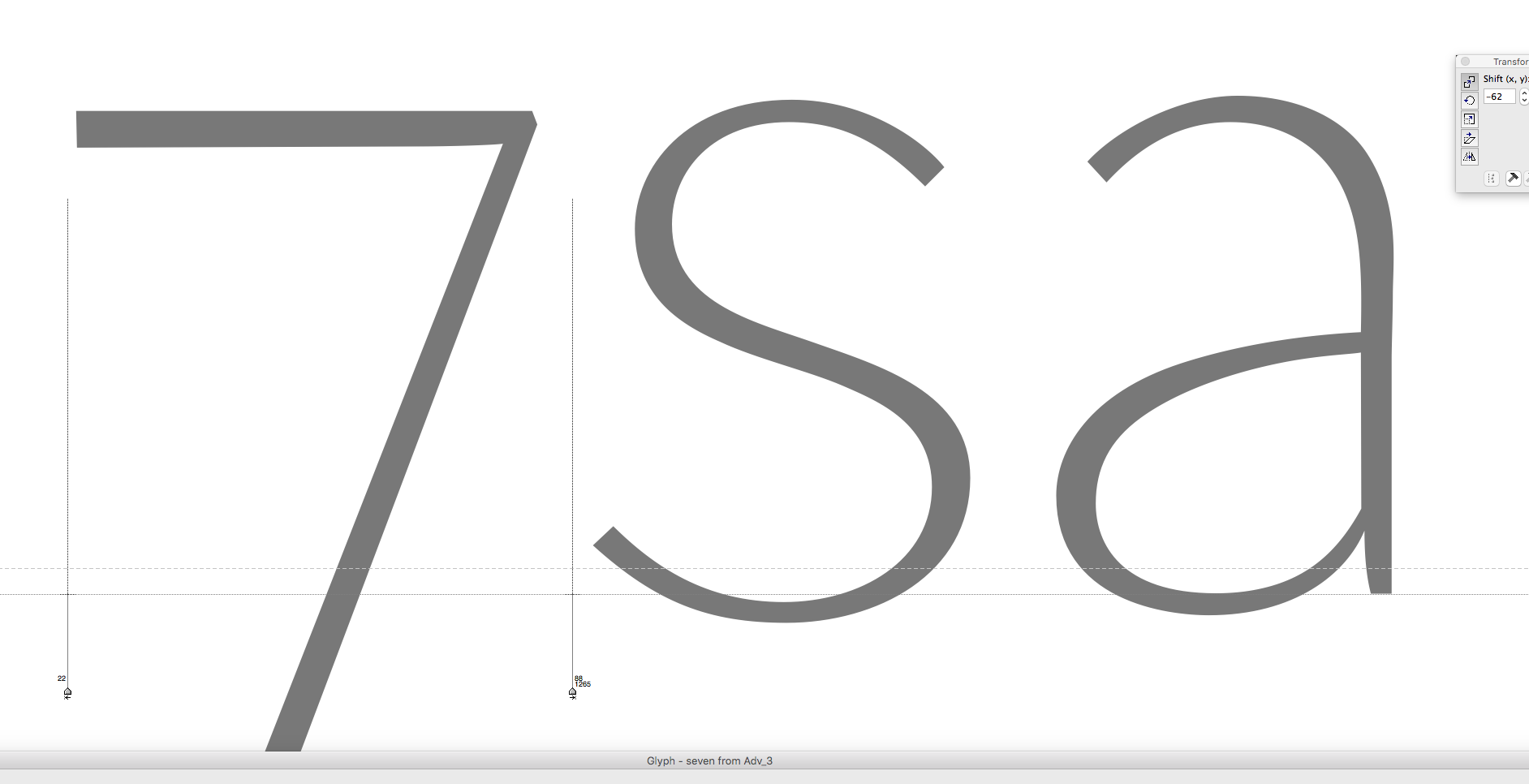

Some of the phases that Advanced has passed through over the years. (Images on yellow ground are before design revision.) Only screenshots mostly taken from “metrics” window in FontLab without a specific succession or any didactic intention. Would be too hard even trying to describe how many changes the letters forms underwent with passing time. Look at the letter ‘a’ as an example.
Photographs in the background show what I help I could get from other artists and of course the eternal beauty and shape of woman’ bodies. When I am getting stuck on a design I compare my curves with those a thousand times more natural and graceful that they show me as an example and orientation, I guess. Some of them get reflected in my letters when I am lucky.
Credits:
| Photography