Block Update
Many years ago…
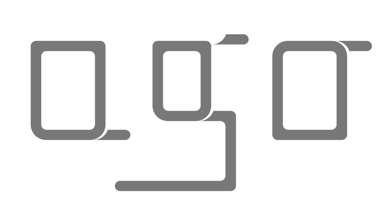
When I am listening to I deserve it by Madonna it seems to feel again something of that wonderful creative spirit of these times. And it happened that I spontaneously added some minor characters to this font called Block and which was one of the results of researching a new font bibliotheque for .
Regarding these fonts it is difficult to exactly describe what was part of their distinction, their character that they should represent. Certainly it is kind of a geometric simplicity, a certain linearity but also with something that Luca Stoppini would have called “cattiveria” in Italian language. Something that for certain verses “bites”, that bit of eccentricity which is so important for fashion design.
Over the years and how it is quite natural gaining more experience and handiness with doing font design I evolved away from that kind of spirit in my font creations, but sometimes it’s just fun to return a little. Here it is. To be continued…

