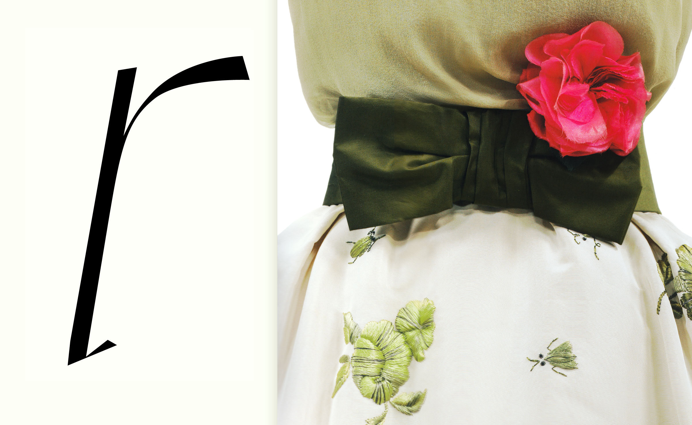
Drapery in Letters
A returning motive in the history of art is that of drapery. The early painting masters in were often judged by their capability to execute this fine art of setting shadows and lines in a way that they perfectly reflect the folding of a piece of cloth.
A thing very similar is taking place also in font design. As the letters derive from calligraphic writing models, still, after centuries of their development, something of their ancestors is contained in their shapes. It is the character of a ribbon folded. And it is “folded” in a much more complex way than a pure calligraphic flat broad nip pen would suggest.
As printing types tend to be more rounded and almost smooth in their appearance in the imaginary world of a type designer they behave more like cloth therefore laying more stress on a certain thickness of this purely imaginary ribbon.
Every type designer knows that even in a sober looking Sans Serif typeface we have so called turning points hidden in their structure which help our eye to better understand why a form develops in a certain way along its outline and not in another. Sometimes I get inspiration not only in the beautiful photo models of a fashion shooting but also of the clothes they wear. See here an ‘r’ of a early version of Reflection Italic which later was transformed into Urbino. At its side a masterly crafted robe photographed by .
Credits:
| Photography
| Robe

