
Derive the Italics
A natural desire once you created a new typeface is to make its accompanying italic version. In the history of typefaces those two separated forms of alphabets have an almost totally different origin. This somehow kept its truth up to today. Both characters ought to make a perfect match but they have clear differences mainly visible in some letters like ‘g’, ‘a’, ‘e’ but also others.
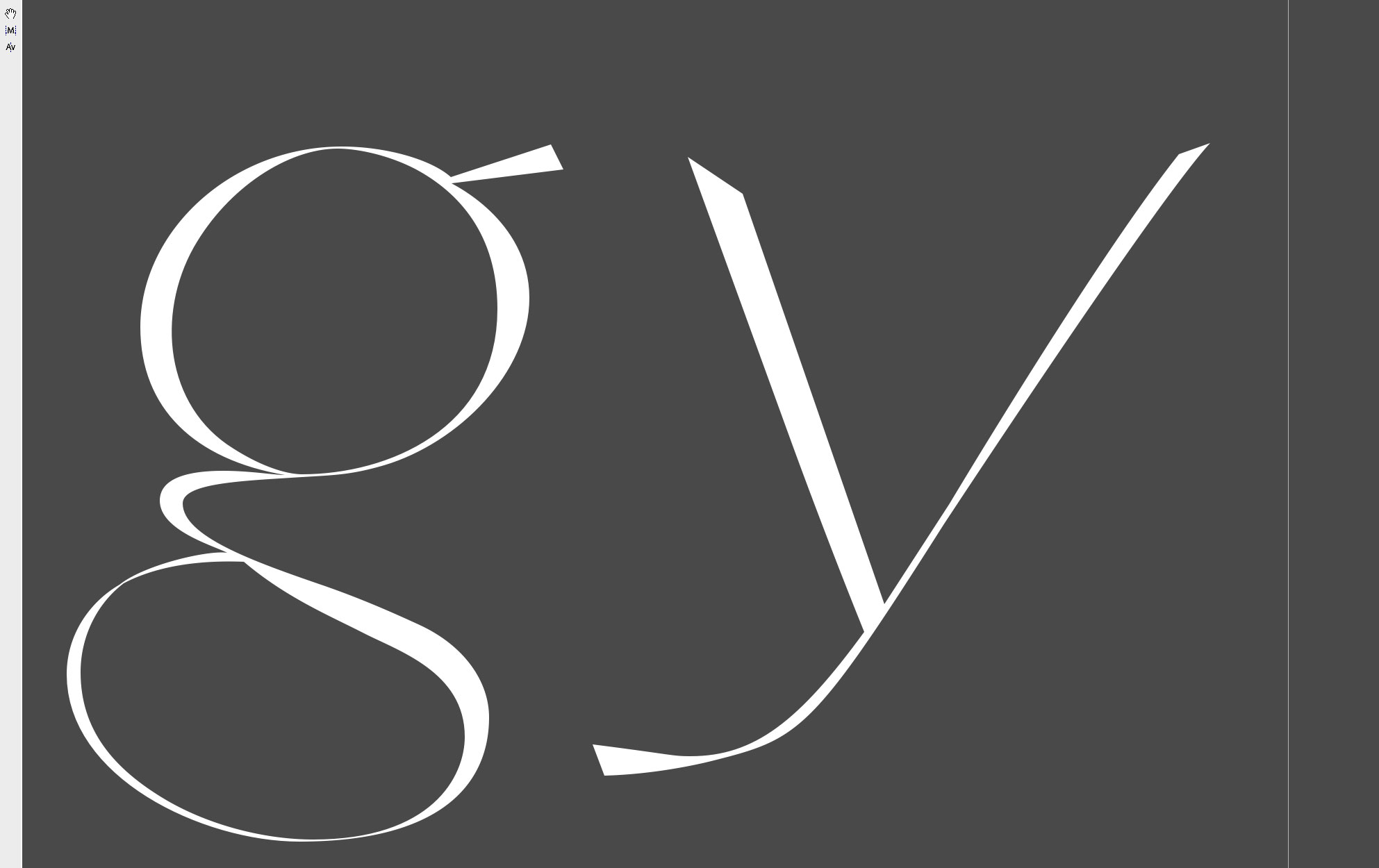
When I confront this task usually I begin with trying out a mathematical slanted versions of a font and then elaborate it until it gets its very own nature. This is what I did with Reflection which in the end became Urbino. Yet, I recently stumbled upon some of its intermediate ‘BackUps’ and what struck me most was this ‘g’. I guess I’ve (re)fallen in love with its overall hidden ‘circular’ shapes and its weird form attachments I seem to have felt necessary. Well, a tribute to an old love story which was creating Reflection.