The Paths of Inspiration
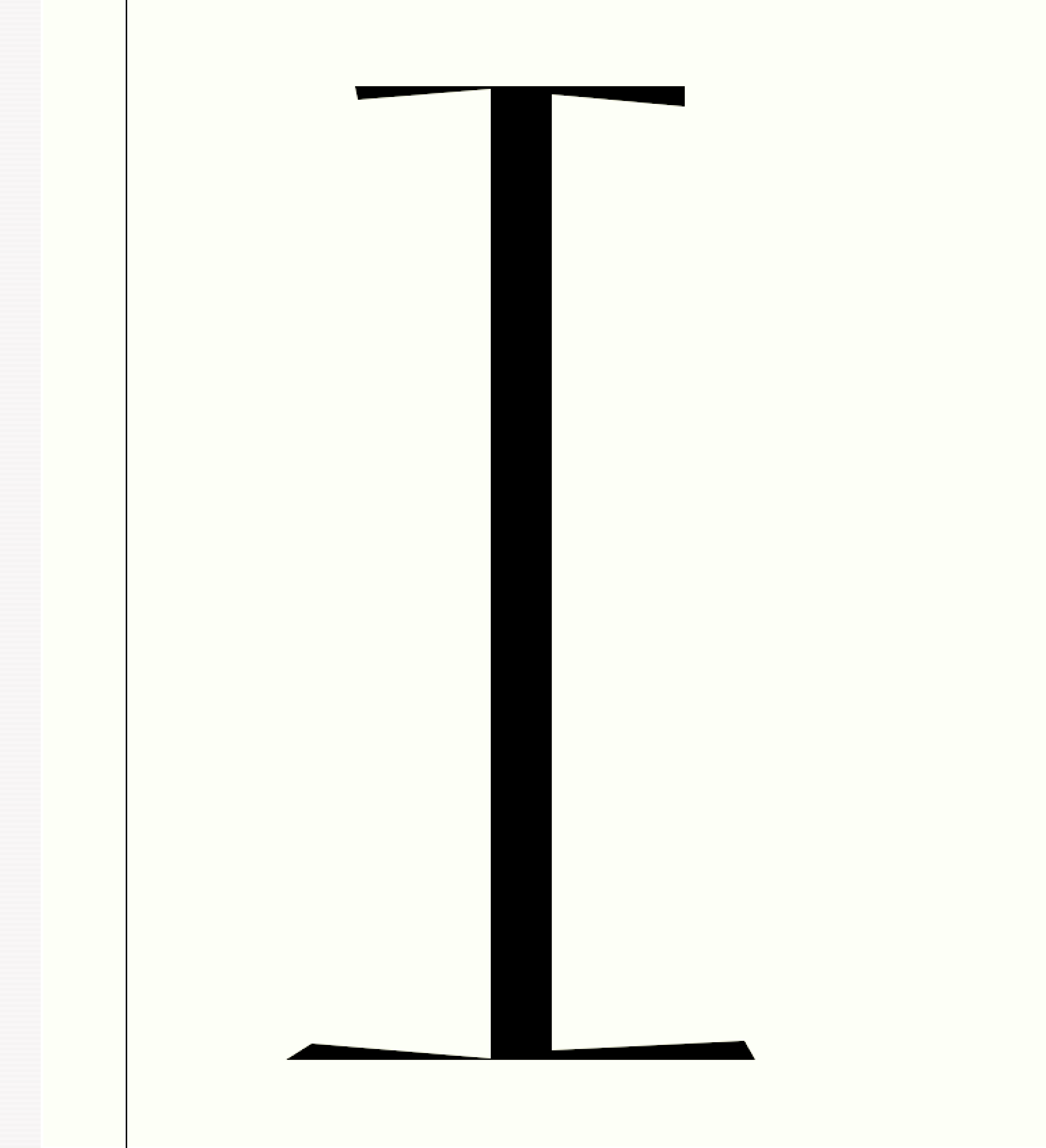
As I am not drawing my typefaces first with a pencil on paper instead doing them directly on monitor I learned to follow my instincts or let’s call it the paths of Inspiration. This letter form Reflection Small Caps happens to end up with strange asymmetric serifs because something seemed to tell me to do so.
When I saw the result it reminded me spontaneously of some of the Renaissance paintings by which have as a particular detail a background horizon line that differs in height on the left and right side of the portrayed central figure. Even if we might not agree with some of the mystic theories that have been spun around that curious issue it still seems to be a fact that our brain tends to differently weigh two sides of a same composition.
In typeface design subtle details like these can help our letters to get into a natural flow chaining them together for the eyes and following reading direction. But things like these shouldn’t be the result of a thinking process, I believe. They should crystallize out of working process and most of all in those very moments when we tend to forgot our rational intents but blindly follow her path.
Read also [German language]

