
‘TRU’ Trussardi Lettering
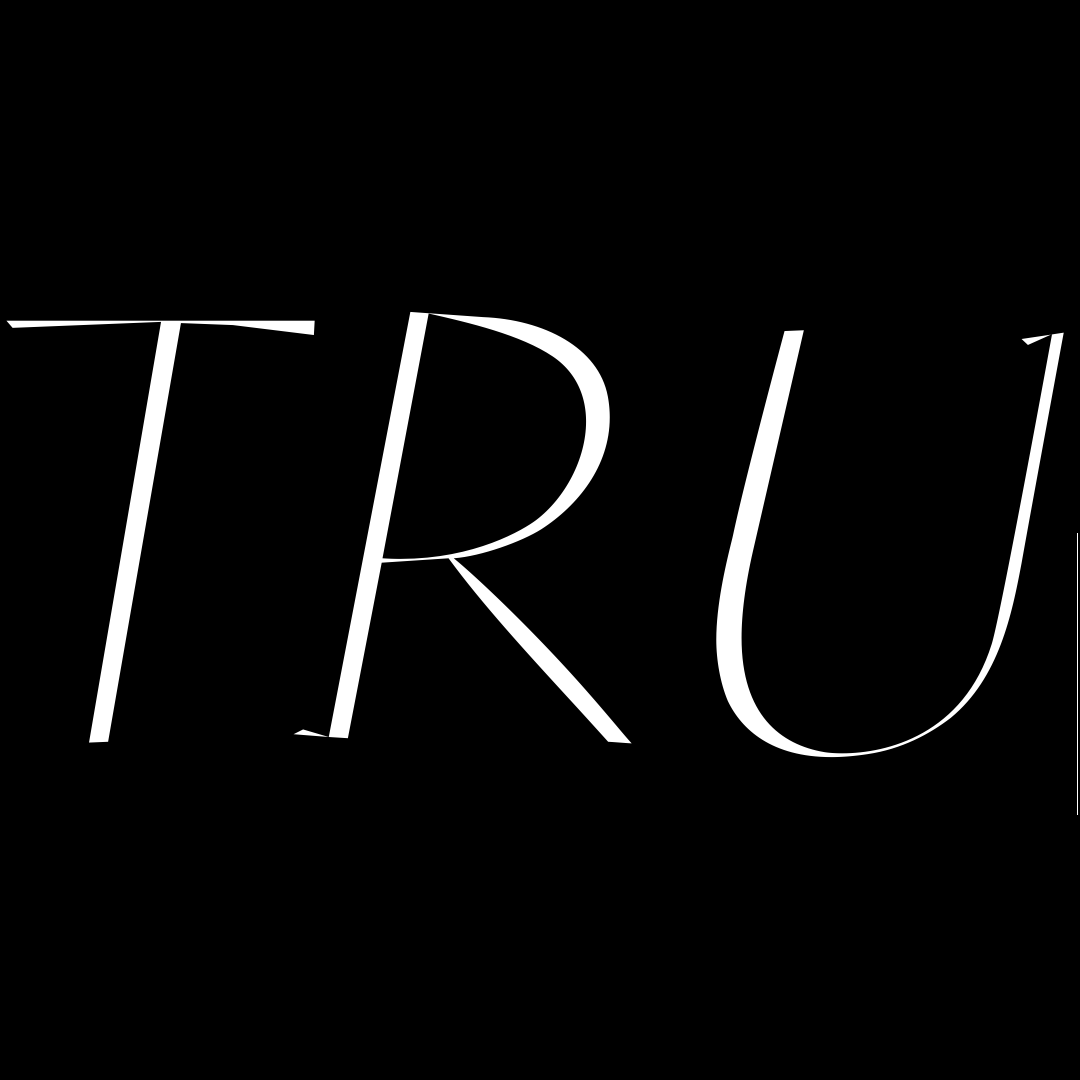
During the drawing process of Urbino Typeface I enjoyed doing some lettering researches for the classic fashion griffe. This is a detail from Metrics window during the elaboration of the letters ‘R’ and ‘U’. The latter one is a particular challenge in serif typefaces. It has a delicate balance and symmetry between stems. The right one that has to have the part of hairline, yet, cannot be a slim as in other letters specially when not equipped with a full serif.
Urbino Typeface is dealing a lot with these subtle contradictions which arise by being a serif typeface on the one hand, yet, having definitely some of the characteristics of a Sans Serif character on the other. Uppercase letters also show something of almost ancient Roman alphabets carved into stone. Urbino which I derived as an Italic variant of Reflection typeface has a particular long story within my type creations. Much time has been dedicated to it over the years and I still love it a lot.